VOO vs SPMO: Should You Trade the S&P 500 for Its Momentum Version? [2026]
This article is for educational and informational purposes only. It does not constitute investment advice. Past performance does not guarantee future results. Always do your own research before making any investment decisions.
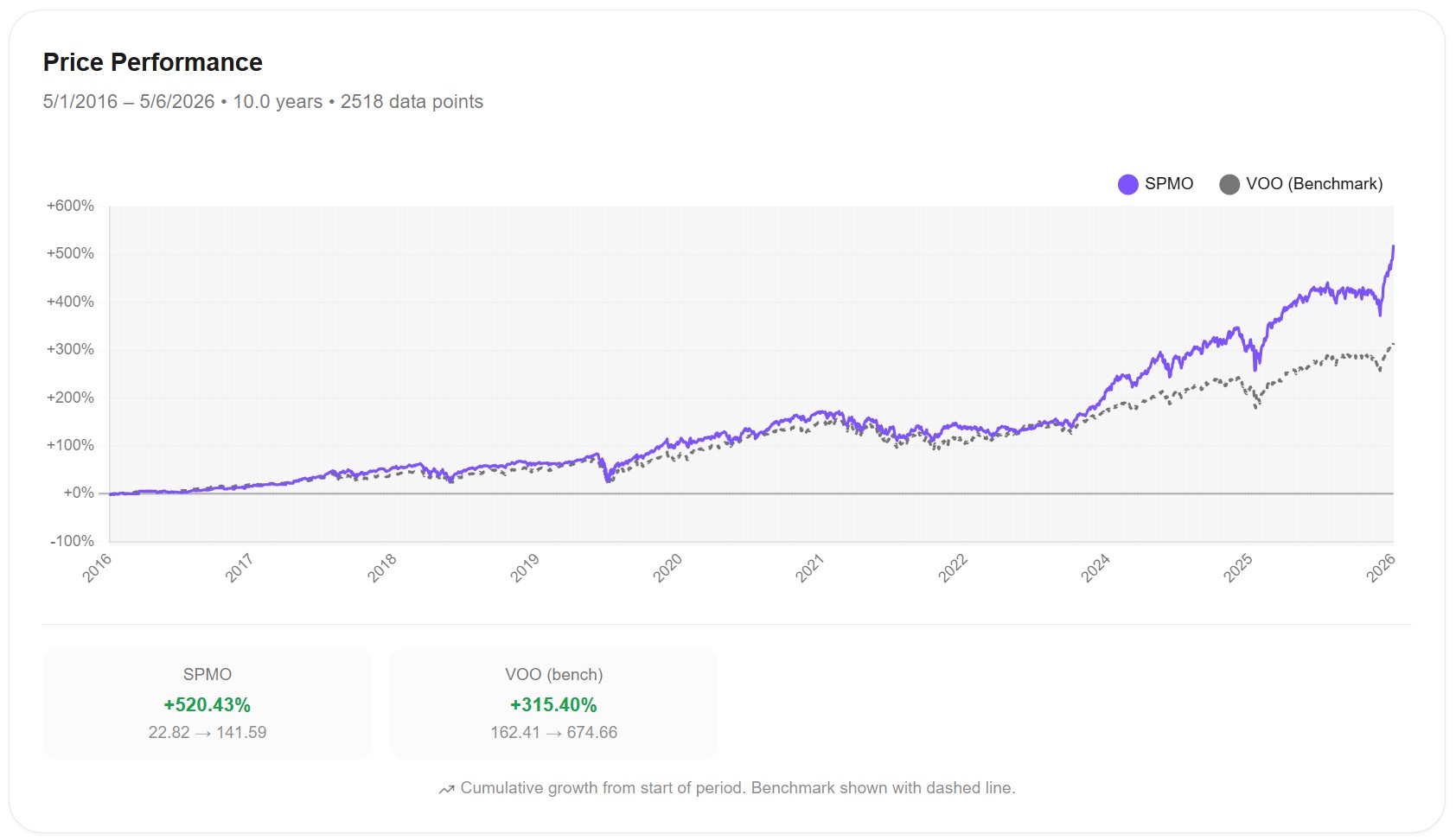
Over the last 10 years, the Invesco S&P 500 Momentum ETF (SPMO) returned 520.43%. Vanguard's S&P 500 ETF (VOO) returned 315.40% in the same window. That's 205 percentage points of extra return, or roughly 4.7% per year in annualized outperformance.
The standard story would be "yes, momentum works but at the cost of higher volatility and worse drawdowns." That's how most factor ETFs trade off return against risk — including MTUM, the iShares momentum ETF, which I analyzed in What Is Factor Investing?.
SPMO doesn't fit that pattern. Its Sharpe ratio is higher than VOO's (1.007 vs 0.882). Its max drawdown is smaller than VOO's (-30.93% vs -34.01%). In 2022 — the worst year of the decade for US equities — SPMO lost only -10% while VOO lost -19%. The momentum factor was supposed to crash hardest in regime reversals. SPMO did the opposite.
Something interesting is going on. This article walks through what.
What Is SPMO?
SPMO is the Invesco S&P 500 Momentum ETF. It tracks the S&P 500 Momentum Index, which selects the ~100 stocks from the S&P 500 with the strongest "momentum" — the highest risk-adjusted price performance over the trailing 6 to 12 months. The index rebalances twice a year, in March and September.
Three things matter about that construction. The universe is just the S&P 500 — SPMO can only hold stocks already in the broad index. Only ~100 stocks make the cut at any time, compared to VOO's full 487 holdings. And the rebalance is semi-annual, not monthly or quarterly, which means the portfolio can hold the wrong stocks for up to six months before being adjusted.
SPMO launched in October 2015, giving it about 10 years of live performance history. Its expense ratio is 0.13%, compared to VOO's 0.03% — a 10-basis-point premium for the momentum filter. Assets under management have grown from roughly $300 million in 2020 to over $16 billion in 2026, with most of that growth in the last 24 months.
The Headline Numbers
Here's how $10,000 invested in each ETF performed from May 1, 2016 to May 6, 2026:
And the full performance metrics:
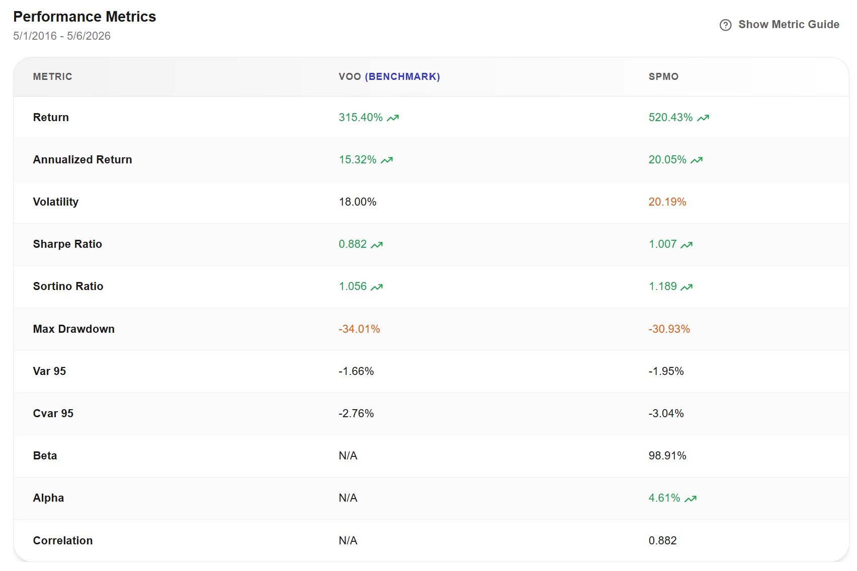
The key numbers, side by side:
| Metric | VOO | SPMO |
|---|---|---|
| Total return | 315.40% | 520.43% |
| Annualized return | 15.32% | 20.05% |
| Volatility | 18.00% | 20.19% |
| Sharpe ratio | 0.882 | 1.007 |
| Sortino ratio | 1.056 | 1.189 |
| Max drawdown | -34.01% | -30.93% |
| Alpha vs VOO | — | +4.61% |
| Beta | — | 0.989 |
| Correlation | — | 0.882 |
The numbers tell a coherent story. SPMO delivered higher absolute return, with slightly higher volatility, but better Sharpe and Sortino ratios, and a smaller max drawdown. The 4.61% alpha is unusually high for a factor ETF and unusually persistent across a 10-year window. Beta near 1 (0.989) means SPMO moves about as much as the broad market for each market move, but adds extra return on top.
This combination is rare. Most factors deliver one of three things: more return with worse Sharpe (MTUM, the iShares momentum ETF), less volatility with less return (USMV), or essentially the broad market with a quirk (QUAL). SPMO is the rare case of more return with better risk-adjusted metrics.
Where the Outperformance Came From
Year by year, the gap looks like this:
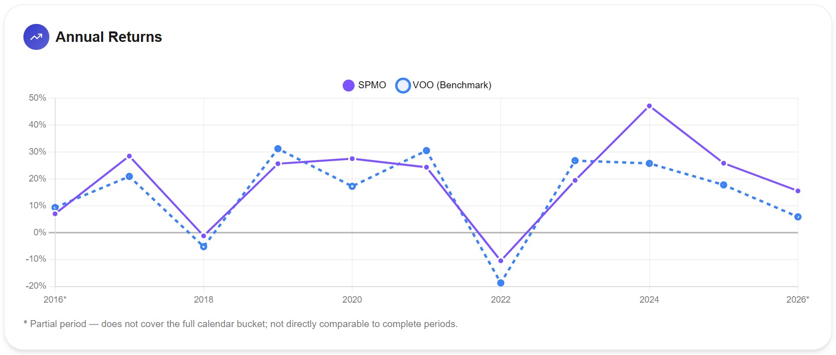
Three patterns jump out.
SPMO underperformed VOO in 2019, 2021, and 2023. Those were the years when broad mega-cap tech (Apple, Microsoft, Amazon, Tesla) dominated index returns. SPMO didn't hold those names with the same weights, so it lagged.
SPMO outperformed in 2017, 2018, 2020, 2022, 2024, 2025, and 2026 YTD. That's seven of the ten complete years, with 2022 and 2024 being the standouts.
2022 is the surprising one. While VOO lost -19% in the year, SPMO lost only -10%. Most momentum ETFs got crushed in 2022 because the leadership reversed sharply from growth tech to value. SPMO didn't. The semi-annual rebalance had already rotated the portfolio out of mega-cap growth before the worst of the crash hit. By March 2022, SPMO was holding more energy, more healthcare, and fewer expensive tech names than the broad index. The crash hit VOO harder than SPMO.
2024 is the boom year. SPMO returned +47% against VOO's +26%. That gap alone accounts for over half of SPMO's total decade-long outperformance. The AI rally favored semiconductor stocks (NVDA, AVGO, AMD, MU), and SPMO had massive overweights to all of them. VOO held them too, but at much lower weights.
The combination of 2022 and 2024 — relative outperformance in both a major drawdown and a major rally — is what built the headline 4.61% alpha.
What's Actually Inside SPMO?
The portfolio composition is where the story stops being mysterious. SPMO doesn't look anything like VOO at the holding level.
Let's start with the top 10 holdings:
| Rank | VOO | weight | SPMO | weight |
|---|---|---|---|---|
| 1 | NVDA | 7.58% | NVDA | 8.59% |
| 2 | AAPL | 6.67% | AVGO | 7.91% |
| 3 | MSFT | 4.92% | MU | 7.72% |
| 4 | AMZN | 3.64% | GOOGL | 5.36% |
| 5 | GOOGL | 3.00% | GOOG | 4.25% |
| 6 | AVGO | 2.63% | JNJ | 4.21% |
| 7 | GOOG | 2.40% | LRCX | 3.35% |
| 8 | META | 2.24% | XOM | 3.23% |
| 9 | TSLA | 1.87% | AMD | 3.11% |
| 10 | BRK-B | 1.57% | INTC | 3.04% |
The difference is dramatic. SPMO does not hold Apple, Microsoft, Amazon, Meta, Tesla, or Berkshire Hathaway. Six of the ten largest US companies by market cap are absent from the SPMO top 10 entirely (some sit much further down the holdings list, but not in meaningful weight).
What SPMO holds instead, in the top 10, is:
- Six semiconductor stocks (NVDA, AVGO, MU, LRCX, AMD, INTC) — three of them in the top three positions
- Two Alphabet share classes (GOOGL + GOOG together = 9.61% of SPMO)
- Two defensive value names (JNJ and XOM)
The top 10 holdings represent 50.8% of SPMO's total weight. Add the rest of the top 50, and you're at 91.6%. The fund is highly concentrated — 102 holdings total versus VOO's 487 — and tilted heavily toward specific themes.
Sector exposure tells the same story:
| Sector | VOO | SPMO | Difference |
|---|---|---|---|
| Information Technology | 32.8% | 50.2% | +17.4 pp |
| Industrials | 9.1% | 13.6% | +4.5 pp |
| Healthcare | 9.5% | 6.9% | -2.6 pp |
| Communication Services | 10.3% | 9.8% | -0.5 pp |
| Financials | 10.7% | 5.9% | -4.8 pp |
| Consumer Staples | 5.2% | 4.3% | -0.9 pp |
| Energy | 4.0% | 3.6% | -0.4 pp |
| Consumer Discretionary | 10.0% | 1.2% | -8.8 pp |
| Utilities | 2.5% | 1.4% | -1.1 pp |
| Materials | 2.0% | 1.7% | -0.3 pp |
The biggest deviations are massive overweight to Information Technology (+17 pp), and massive underweight to Consumer Discretionary (-9 pp — essentially zero exposure). Within IT, the tilt is specifically toward semiconductors rather than the platform giants. Within Consumer Discretionary, the absence of Amazon and Tesla explains nearly all of the underweight.
This is not "S&P 500 with a momentum nudge." It's a concentrated bet on a specific basket — semiconductors plus a few defensive value names plus Alphabet — chosen by the momentum filter at each rebalance.
The 2022 Story: Why SPMO Held Up
Now the 2022 outperformance makes sense.
By early 2022, the momentum factor had been signaling for over a year that growth tech leadership was weakening. The S&P 500 Momentum Index rebalance in March 2022 — right at the start of the bear market — would have rotated the portfolio further out of mega-cap growth and into the names that had outperformed in late 2021 (energy, defensive value, some semiconductors).
When inflation surged and the Fed raised rates, growth stocks repriced hardest. Apple, Microsoft, Amazon, Meta, and Tesla all dropped 30% to 60% during 2022. SPMO wasn't holding most of them. VOO was, at the largest weights in the index.
This is the semi-annual rebalance working in SPMO's favor. A monthly or continuously rebalanced momentum fund (like MTUM) might have chased the late-2021 growth rally too long and been caught when it reversed. SPMO's slower cadence happened to align with the regime shift.
Whether this continues in future regime shifts is unknown. The semi-annual rebalance can also work against the fund — if leadership shifts mid-cycle, SPMO holds the wrong basket for up to six months before correcting.
Correlation: How Different Is SPMO Really?
The correlation chart tells a more nuanced story than the holdings table:
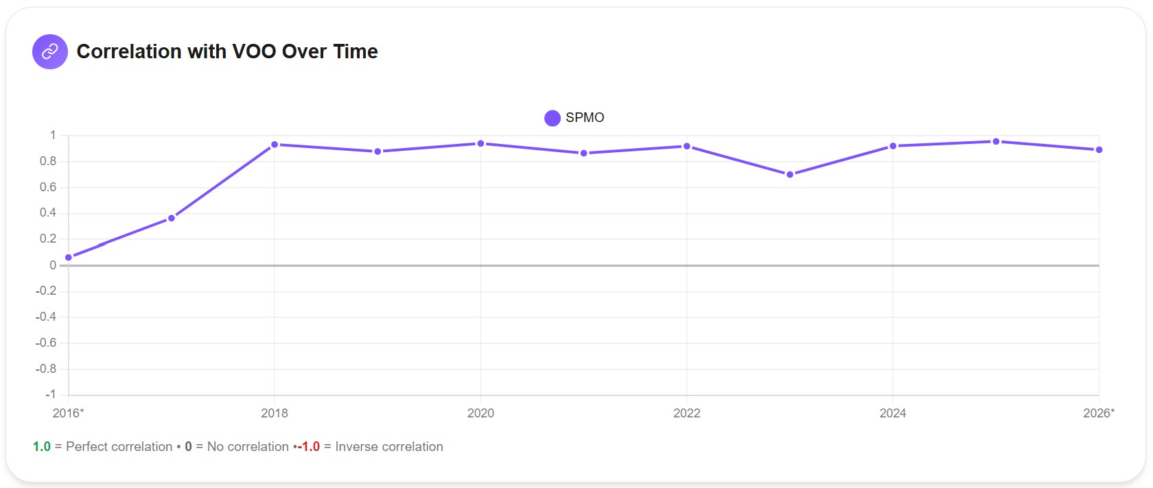
SPMO's correlation with VOO ranges from about 0.70 to 0.95 across the decade. The average is around 0.88. They move together most of the time, just not perfectly. The lowest correlation (~0.70) came in 2023, when the portfolios were holding very different things and the market was rewarding the broader index.
The holdings overlap data adds another layer. Of the 477 unique stocks across both ETFs, 97 are shared. But weighted overlap is asymmetric:
- 33.75% of VOO's weight is in stocks also held by SPMO
- 99.71% of SPMO's weight is in stocks also held by VOO
Almost everything in SPMO is somewhere in VOO. But two-thirds of VOO's weight is in stocks SPMO doesn't hold. SPMO is essentially a "concentrated subset of VOO that the momentum filter picked." Whether that subset behaves like VOO depends entirely on whether the picked stocks happen to move with the broader index in any given period.
For diversification purposes, holding both VOO and SPMO doesn't add much. You'd be doubling up on the 99.7% of SPMO that's already inside VOO. I covered this kind of fake diversification in What Is Portfolio Diversification? — owning more ETFs doesn't always mean owning more positions.
The Volatility Trade-Off
The risk side is where the trade-off lives, even if it's smaller than expected:
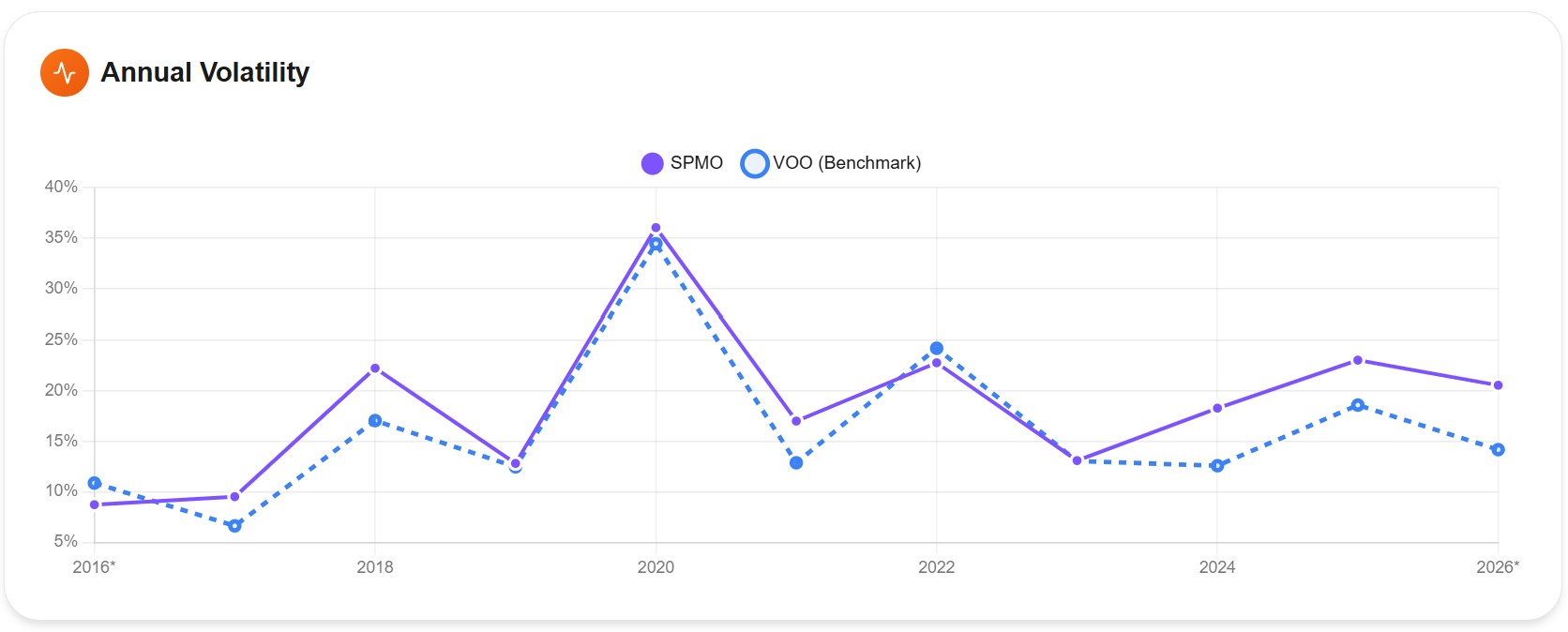
SPMO ran a slightly higher annual volatility than VOO in most years — typically 1 to 4 percentage points higher. The gap widened in 2024-2026, when SPMO's heavy semiconductor exposure made it more sensitive to AI sentiment swings. The overall 10-year volatility figures are 20.19% for SPMO vs 18.00% for VOO — a 12% higher volatility in relative terms.
That's the cost of the concentration. SPMO holds fewer stocks, with bigger individual weights, in less diversified sectors. When semiconductors have a rough quarter, SPMO feels it more than VOO. But the trade-off has been favorable on net: the extra return (4.7% per year) has more than compensated for the extra volatility, hence the better Sharpe ratio.
Should You Replace VOO with SPMO?
The honest answer depends on what you're trying to accomplish.
If you want low-cost, low-maintenance, low-decision-required broad US equity exposure, VOO remains the better default. It's cheaper (0.03% vs 0.13%), more diversified (487 vs 102 holdings), and behaves predictably across regimes. The 4.7% per year that SPMO added in this specific decade is real, but it depends on the momentum filter continuing to identify the right baskets at the right times.
If you want to add factor exposure on top of a broad-market core, SPMO is a legitimately interesting option — one of the few momentum ETFs that has actually delivered better risk-adjusted returns over its live history. A 70-80% VOO/VTI core plus a 20-30% SPMO tilt is a reasonable expression of the factor without going all-in. Backtest the combined portfolio rather than the individual pieces, since the interaction between core and tilt is what determines the actual experience.
What I'd avoid is treating SPMO as "VOO but better." It's a meaningfully different portfolio. In some regimes — broad mega-cap rallies, like 2019 or 2023 — SPMO can lag VOO by 5 to 8 percentage points. If you can't tolerate that kind of underperformance for years at a time, the same momentum factor that helped in 2022 and 2024 will frustrate you when leadership shifts back to the broad index.
The Honest Question About Future Returns
SPMO's 10-year track record is one of the more impressive factor outcomes I've seen, and the data above is solid. But two structural questions deserve attention.
The track record is short. SPMO launched in October 2015. The fund has lived through the post-2016 bull run, the COVID crash, the 2022 bear market, and the AI rally. It has not lived through a true multi-year bear market, a deflationary recession, or a decade-long sideways grind. The 4.61% alpha is what we observed in this specific decade, not what we should assume for the next one.
Factor crowding is real. SPMO's AUM grew from roughly $300 million to over $16 billion in five years, with most of that growth in 2024-2025 after the AI-driven outperformance. As more capital chases the momentum factor, the prices of the stocks the factor selects get pushed up faster — which can erode the alpha the factor was supposed to capture. Some academic research suggests that factor premiums tend to weaken once they become widely known and arbitraged.
The concentration cuts both ways. SPMO's top 10 holdings represent 50.8% of the fund. If the semiconductor cycle turns sharply, SPMO will feel it. The same concentration that helped during the 2024 AI boom can hurt fast in a different regime. The historical track record was built in a period that favored what SPMO happened to hold; future periods may not.
None of this invalidates the data. It just means treating the last 10 years as information, not forecast.
Run Your Own
The data in this article came from Awalyt's backtest engine running on daily-precision data, the same 2,518 points shown in the charts above. If you want to test a different time window, a blended VOO + SPMO portfolio, or compare SPMO against another factor ETF like MTUM — or against a growth fund, the way I did in SPMO vs VUG — you can run your own backtest with full control.
Free Resource
VOO vs SPMO — Complete Data Report
Full Excel report with 10 years of daily performance data, sector allocation breakdown, top 50 holdings, and holdings overlap analysis for VOO and SPMO.
Download the Report →No account required — just your email.
Key Takeaways
- Over 10 years (May 2016 to May 2026), SPMO returned 520.43% vs VOO's 315.40% — an annualized 20.05% vs 15.32%.
- SPMO delivered alpha of 4.61%, a higher Sharpe ratio (1.007 vs 0.882), and a smaller max drawdown (-30.93% vs -34.01%). This combination is rare among factor ETFs and contrasts with MTUM, which delivered alpha but with worse risk-adjusted metrics.
- SPMO does not hold Apple, Microsoft, Amazon, Meta, Tesla, or Berkshire Hathaway in its top 10. It is heavily concentrated in semiconductors (NVDA, AVGO, MU, LRCX, AMD, INTC) plus Alphabet and a few defensive value names.
- The 2022 outperformance (-10% vs -19% for VOO) came from the semi-annual rebalance rotating the portfolio out of mega-cap growth before the worst of the bear market.
- The 2024 outperformance (+47% vs +26%) came from heavy semiconductor exposure during the AI rally.
- Only 33% of VOO's weight overlaps with SPMO, but 99.7% of SPMO's weight is inside VOO. Holding both adds limited diversification.
- The 10-year track record is impressive but short, and SPMO's $16B AUM (up from $300M five years ago) raises legitimate questions about factor crowding eroding future alpha.
The numbers above are real. Whether they continue depends on whether the momentum factor keeps identifying the right baskets in regimes that may look very different from the last decade.
This article is for educational and informational purposes only. It does not constitute financial, investment, or tax advice. Past performance does not guarantee future results. Always do your own research and consider consulting a qualified financial advisor before making investment decisions.
Want to test these insights on your own portfolios?
Awalyt is a portfolio analysis platform: backtesting on daily data, fundamental analysis, asset analysis, and AI-powered insights.
Get Started FreeRelated Insights
If You Invested $10,000 in VOO 10 Years Ago, Here's What You'd Have Today [2026]
9 min read
If You Invested $10,000 in QQQ 10 Years Ago, Here's What You'd Have Today [2026]
10 min read
VOO vs QQQ: Which Should You Buy? [2026 Data + Overlap Analysis]
11 min read