VOO vs QQQ: Which Should You Buy? [2026 Data + Overlap Analysis]
VOO or QQQ. Broad market or tech growth. This is a different kind of ETF debate than the usual VOO-vs-VTI discussion where the two funds are nearly identical. VOO and QQQ track different indexes, hold different numbers of stocks, charge different fees, and have produced very different results over the last 15 years.
The question isn't which one had higher returns — the answer to that is obvious and you can find it on any financial website. The question is whether QQQ's outperformance justifies its higher risk, what the overlap between the two really looks like, and whether holding both makes any sense at all.
We pulled 15 years of daily performance data, full holdings breakdowns, and sector allocations to answer all three.
This article is for educational and informational purposes only. It does not constitute financial, investment, or tax advice. Past performance does not guarantee future results. Always do your own research and consider consulting a qualified financial advisor before making investment decisions.
What Each ETF Tracks
VOO (Vanguard S&P 500 ETF) tracks the S&P 500 Index — 500 large-cap US companies selected by a committee at S&P Dow Jones Indices. It's the default benchmark for US equity performance.
QQQ (Invesco QQQ Trust) tracks the Nasdaq-100 Index — the 100 largest non-financial companies listed on the Nasdaq exchange. Despite the name, it's not a "tech fund" by mandate, but in practice technology dominates its composition.
| Metric | VOO | QQQ |
|---|---|---|
| Index | S&P 500 | Nasdaq-100 |
| Number of Holdings | 490 | 103 |
| Net Assets (AUM) | $1.40T | $372.5B |
| Expense Ratio | 0.03% | 0.18% |
| Dividend Yield | 1.09% | 0.50% |
| Inception Date | Sep 2010 | Mar 1999 |
Two things jump out. First, the expense ratio: QQQ charges 6x more than VOO. On a $100,000 portfolio, that's $180/year vs $30/year. Not a dealbreaker, but not nothing either. Second, the dividend yield: VOO pays roughly double what QQQ does. QQQ's lower yield is a natural consequence of its heavy tilt toward growth companies that reinvest earnings rather than distribute them.
Sector Allocation: Where the Real Difference Lives
This is where VOO and QQQ stop looking like cousins and start looking like different species.
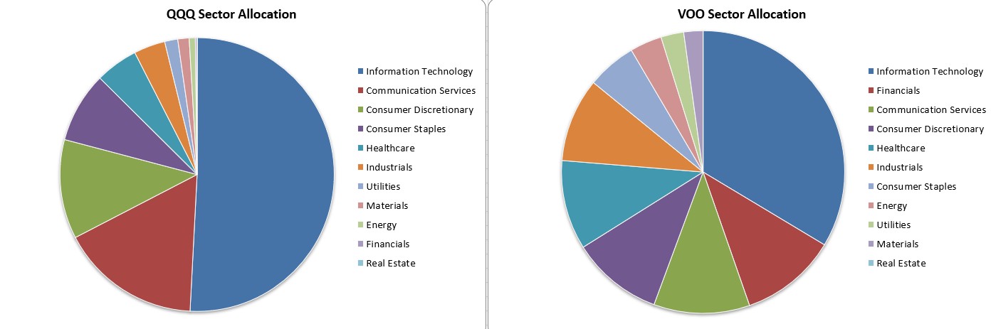
| Sector | QQQ | VOO | Gap |
|---|---|---|---|
| Information Technology | 49.4% | 32.2% | +17.2% |
| Communication Services | 16.1% | 10.5% | +5.6% |
| Consumer Discretionary | 11.4% | 10.0% | +1.4% |
| Consumer Staples | 8.1% | 5.4% | +2.7% |
| Healthcare | 4.9% | 9.8% | −4.9% |
| Industrials | 3.6% | 9.2% | −5.6% |
| Financials | 0.2% | 10.6% | −10.4% |
| Energy | 0.7% | 3.5% | −2.8% |
| Utilities | 1.5% | 2.5% | −1.0% |
| Materials | 1.3% | 2.1% | −0.8% |
| Real Estate | 0.0% | 0.0% | — |
Nearly half of QQQ is in Information Technology. Add Communication Services (which includes Alphabet and Meta), and you're at 65.5% in what most people would broadly call "tech." VOO is at 42.7% for those same two sectors.
The biggest structural gap is Financials. VOO holds 10.6% in banks, insurers, and asset managers. QQQ holds 0.2%. This is by design — the Nasdaq-100 explicitly excludes financial companies. It also means QQQ almost completely misses sectors like Energy, Industrials, and Healthcare. These aren't small sectors; combined they represent over 22% of the S&P 500.
When tech rallies, QQQ rides the wave harder. When tech sells off, QQQ has very little to cushion the fall. That's not a flaw — it's the bet you're making.
Holdings: Same Top Names, Very Different Concentration
The top 10 holdings of both funds look familiar.
| # | QQQ | Weight | VOO | Weight |
|---|---|---|---|---|
| 1 | NVIDIA | 8.69% | NVIDIA | 7.31% |
| 2 | Apple | 7.47% | Apple | 6.63% |
| 3 | Microsoft | 5.55% | Microsoft | 4.96% |
| 4 | Amazon | 4.61% | Amazon | 3.47% |
| 5 | Alphabet (A) | 3.57% | Alphabet (A) | 3.08% |
| 6 | Tesla | 3.47% | Broadcom | 2.56% |
| 7 | Meta | 3.41% | Alphabet (C) | 2.46% |
| 8 | Alphabet (C) | 3.32% | Meta | 2.40% |
| 9 | Walmart | 3.32% | Tesla | 1.92% |
| 10 | Broadcom | 3.18% | Berkshire Hathaway | 1.57% |
Same mega-caps at the top. But notice the concentration: QQQ's top 10 holdings represent 46.6% of the fund. VOO's top 10 are 36.4%. That 10-point gap matters. When NVIDIA drops 5% in a day, it pulls QQQ down roughly 0.43% but VOO only 0.37%.
The top 50 tell an even bigger story: 86.8% of QQQ vs 60.4% of VOO. With only 103 holdings total, QQQ is a concentrated fund — there's nowhere to hide.
The Overlap: 94.8% of QQQ Is Already in VOO
This is the number most comparison articles miss entirely.
We ran a full holdings overlap analysis. The two ETFs share 85 stocks out of 492 unique holdings combined. By raw count, that's only 17.3% — which sounds low. But by portfolio weight, the picture flips:
94.8% of QQQ's weight is in stocks that also appear in VOO.
Flip it around: only 50.4% of VOO's weight is in stocks shared with QQQ.
The asymmetry tells you something important. If you own VOO, you already hold almost everything in QQQ — just at lower concentrations. QQQ is essentially a concentrated subset of VOO, overweighting tech and growth while dropping financials, energy, and most of healthcare.
This has direct implications if you're thinking about holding both. A 50/50 VOO+QQQ portfolio doesn't give you "the broad market plus some tech exposure." It gives you the broad market with a massive tech overweight — your effective Information Technology allocation would be somewhere around 40%, not the 32% you'd get with VOO alone.
If that's what you want, fine. But go in with your eyes open. You can check the exact overlap for any ETF combination to see what your real exposure looks like before you commit.
📄 Free resource — Full Excel with holdings, sectors & overlap data
Download Report →15 Years of Performance: The Data
We backtested VOO and QQQ from April 2011 to April 2026 using daily-precision data, with SPY as the benchmark.
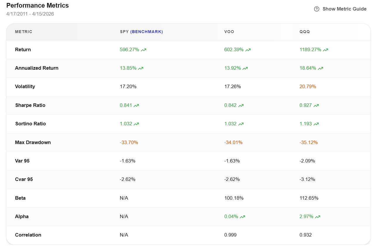
| Metric | VOO | QQQ | Difference |
|---|---|---|---|
| Total Return | 602.39% | 1,189.27% | QQQ nearly 2x |
| Annualized Return | 13.92% | 18.64% | +4.72%/year |
| Volatility | 17.26% | 20.79% | +3.53% |
| Sharpe Ratio | 0.842 | 0.927 | QQQ better |
| Sortino Ratio | 1.032 | 1.193 | QQQ better |
| Max Drawdown | −34.01% | −35.12% | −1.11% |
| Beta | 1.00 | 1.13 | — |
| Alpha | 0.04% | 2.97% | — |
| Correlation to SPY | 0.999 | 0.932 | — |
In dollar terms: $10,000 invested in VOO in April 2011 grew to roughly $70,239. The same $10,000 in QQQ grew to $128,927. That's not a small gap — it's nearly double.
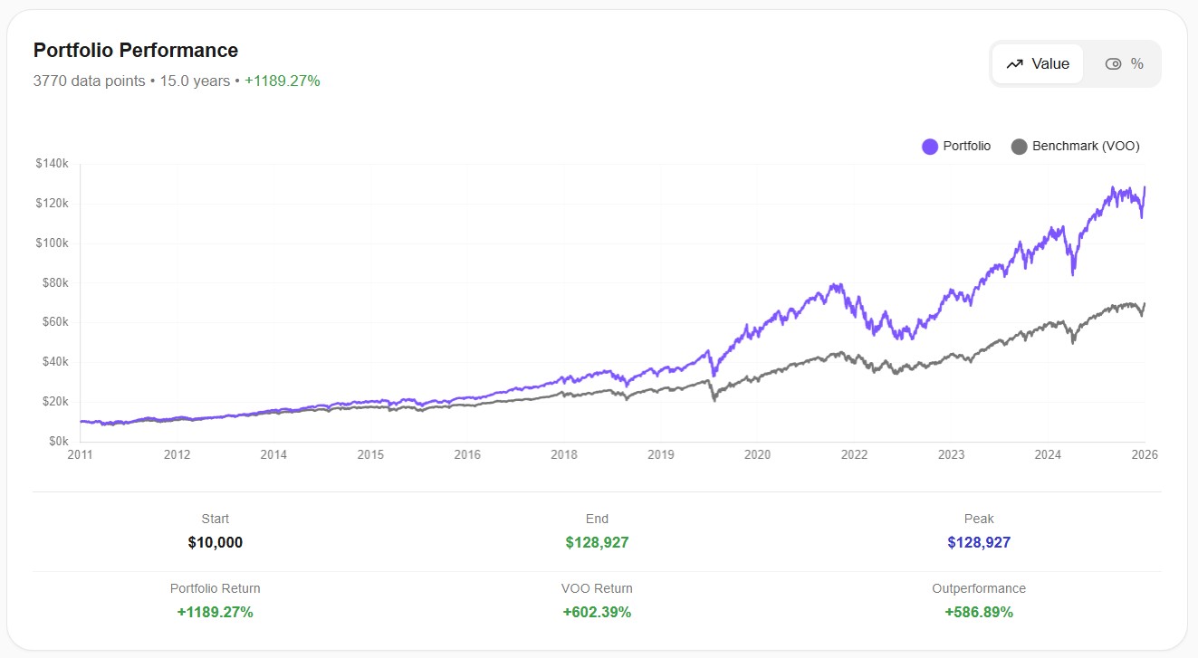
The growth chart makes the divergence visceral. The two lines track closely until around 2017, then QQQ starts pulling away. The gap widens dramatically after 2020, driven by the pandemic-era tech boom that sent companies like NVIDIA, Apple, and Meta to historic highs.
Risk: The Surprising Part
Here's where the data challenges the standard narrative.
The conventional take on QQQ is "higher returns, higher risk, roughly the same risk-adjusted performance." The actual numbers disagree. QQQ's Sharpe ratio — the standard measure of return per unit of risk — is 0.927 vs 0.842. QQQ didn't just deliver more return; it delivered more return per unit of volatility than VOO.
The Sortino ratio, which penalizes only downside volatility (the kind investors actually care about), tells the same story: 1.193 vs 1.032.
And the max drawdown? Only 1.11 percentage points apart. VOO's worst peak-to-trough decline was -34.01%; QQQ's was -35.12%. For a fund with nearly 5 percentage points of extra annualized return, that's a remarkably small increase in worst-case pain.
But these headline numbers hide something the annual drawdown data reveals.
Annual Drawdowns: Different Risks at Different Times
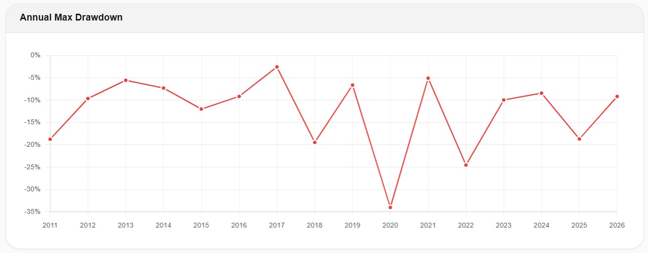
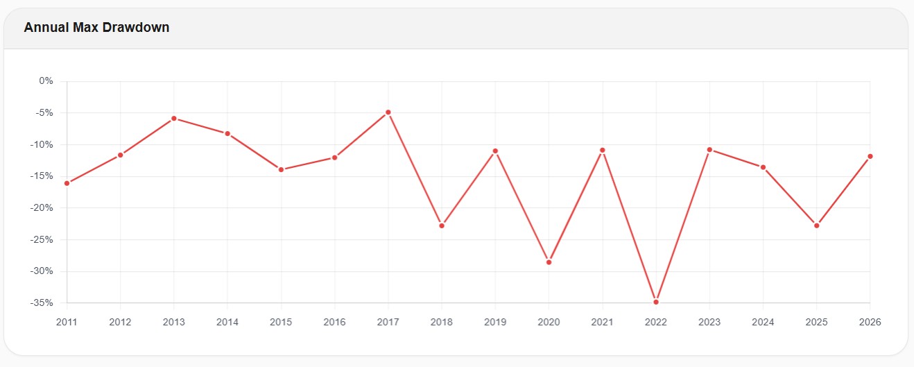
Compare the two drawdown charts year by year, and a pattern emerges. VOO and QQQ had their worst drawdowns in different years:
VOO's worst year: 2020 (COVID crash). The broad market plunged roughly -34% peak-to-trough. QQQ fell too, but only about -29%. Tech was a relative haven during COVID because the pandemic accelerated digital adoption. If your portfolio was QQQ-heavy in March 2020, you fared better than the S&P 500.
QQQ's worst year: 2022 (rate hike cycle). When the Fed raised rates aggressively, growth stocks got crushed. QQQ fell roughly -35%. VOO dropped about -25%. The rate sensitivity of tech valuations — which had been an advantage during the zero-rate era — became a liability when rates normalized.
This pattern is important because it reveals what kind of risk each fund carries. VOO's risk is broad market risk: recessions, pandemics, financial crises. QQQ carries that too, but adds a layer of interest rate sensitivity and valuation compression risk. When money gets more expensive, growth stocks with sky-high multiples have further to fall.
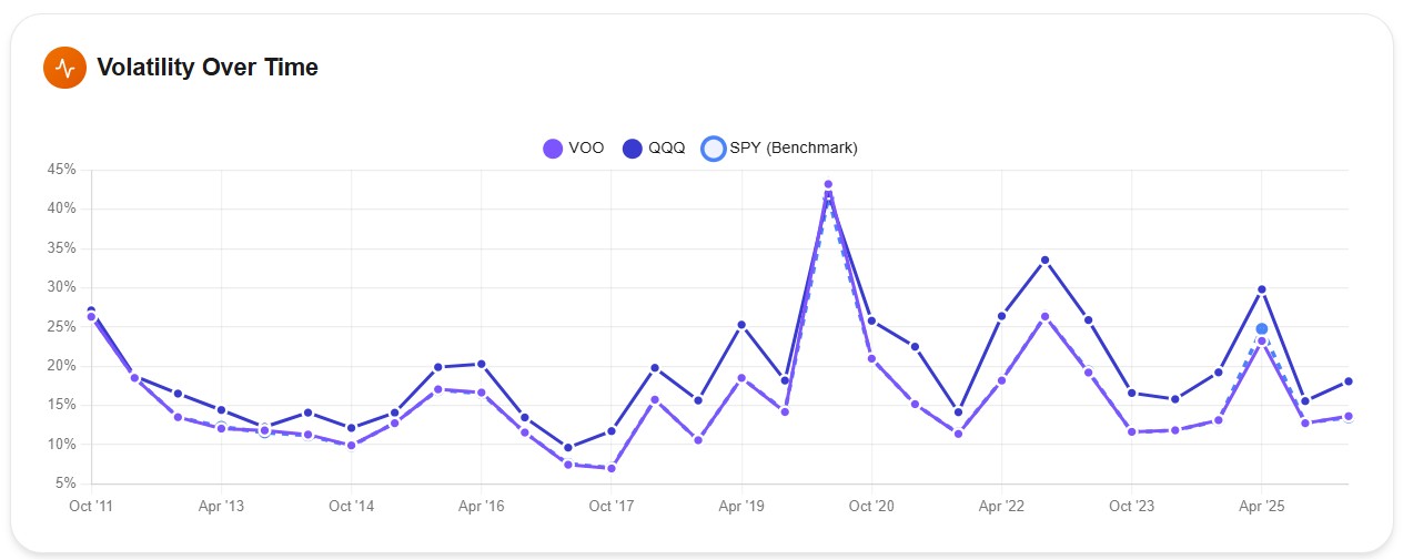
The volatility-over-time chart confirms this: QQQ runs consistently hotter than VOO across the entire period, with particularly sharp spikes during COVID (hitting 43%+) and the 2022 selloff.
The 6-Month Returns: Where You See the Trade-off
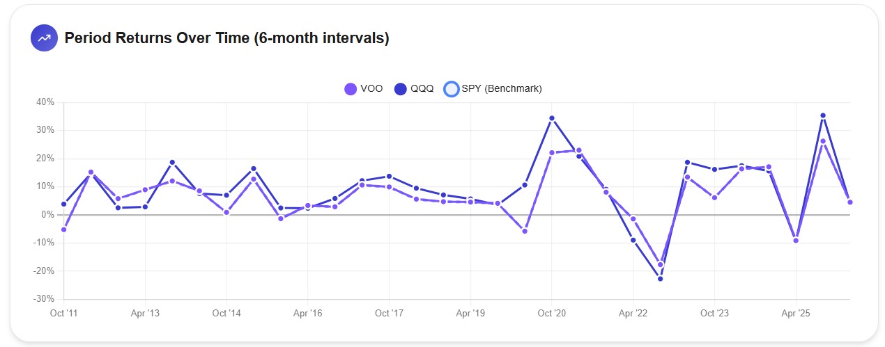
The 6-month returns chart is where the QQQ trade-off becomes visible. When QQQ wins, it wins big — look at the post-COVID recovery (Oct 2020) where QQQ posted roughly +35% in six months while VOO did about +22%. And the late-2025 AI rally shows a similar gap.
But when QQQ loses, it loses harder. The 2022 dip shows QQQ at around -25% over six months while VOO was at roughly -18%.
The wider swings go both ways. If you can stomach the down periods, the up periods have more than compensated for them — so far. That "so far" is doing a lot of work in that sentence.
Correlation: Connected but Not Identical
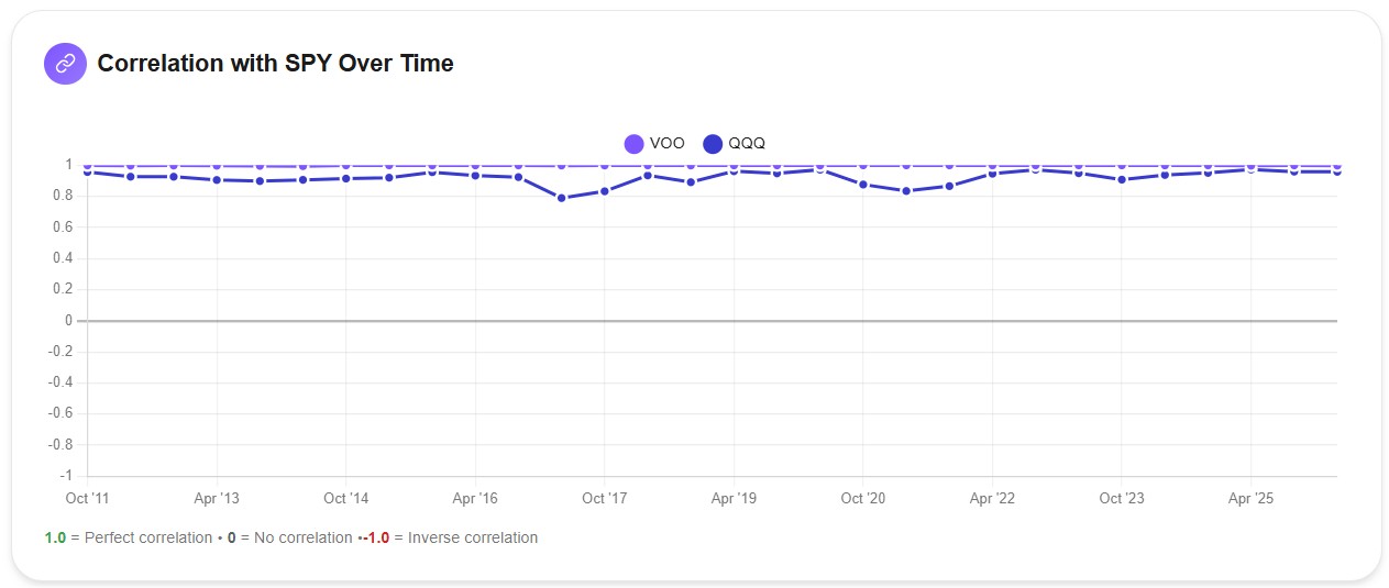
VOO's correlation with SPY stays glued to 1.0 throughout the entire 15-year period — it essentially is the S&P 500. QQQ's correlation fluctuates between 0.78 and 0.95, with notable dips around 2016-2017 and 2022.
The overall correlation between VOO and QQQ is 0.932. High, but not as high as VOO-VTI (0.996). This means there is some genuine diversification value to be had from holding both — but it's limited, and as we saw in the overlap analysis, the diversification comes at the cost of doubling down on tech.
Why QQQ Has Won — And Why It Might Not Keep Winning
QQQ's outperformance maps directly to one phenomenon: the unprecedented dominance of a handful of mega-cap tech companies. Apple, Microsoft, NVIDIA, Amazon, Alphabet, Meta, and Tesla drove the majority of US equity returns in this cycle. QQQ holds these stocks at roughly 1.5-2x the concentration of VOO. When they win, QQQ wins harder. It's that simple.
But this era of tech dominance is historically unusual. From 2000 to 2009, the Nasdaq lost over 40% of its value while the S&P 500 was roughly flat. QQQ didn't just lag — it got decimated. Anyone who bought QQQ at the dot-com peak in March 2000 waited until 2015 to break even. I aim for at least 15 years of data in backtests for exactly this reason: shorter windows can make cyclical outperformance look like a permanent edge.
The 2022 drawdown data offers a smaller-scale preview of what a regime change looks like. When rates rise and valuations compress, QQQ's concentration becomes a liability rather than an advantage. The fund dropped 10 percentage points more than VOO that year.
The honest answer is: nobody knows whether tech will keep dominating. If you believe it will — because of AI, because of digital transformation, because of the structural advantages of platform businesses — QQQ is a way to express that conviction. If you're less certain, VOO gives you exposure to those same companies at a more moderate weight, with sectors like financials, healthcare, and industrials as ballast.
Should You Own Both?
This is one of the most-searched questions around these two ETFs, and the overlap data gives a clear answer.
If you hold both VOO and QQQ in equal weight, you're not "diversifying" — you're concentrating. Your effective tech allocation goes from 32% (VOO alone) to roughly 40%+. You double-count 85 stocks, with the mega-cap tech names weighted heavier than either fund would on its own.
Does that mean it's a bad idea? Not necessarily. Some investors want a deliberate tech overweight and using VOO+QQQ is one way to achieve it. But make sure you understand what you're building. A 70% VOO / 30% QQQ split, for example, gives you something close to the S&P 500 with a growth tilt — which might be exactly what you want.
The key is to check your actual portfolio-level exposure rather than looking at each fund in isolation. What feels like two diversified positions can be one concentrated bet in disguise. This is exactly the kind of thing portfolio overlap analysis tools are built for — seeing through the ticker-level view to what you actually own.
When One Makes More Sense Than the Other
VOO is probably the better fit if:
You want a single core US equity holding with broad sector exposure. You don't have a strong view on whether tech will continue to outperform, and you'd rather own the whole market than make a sector bet. You value the lower expense ratio (0.03% vs 0.18%) and the higher dividend yield (1.09% vs 0.50%). Or you're building a diversified portfolio with separate allocations to sectors or factors and want your core to be as neutral as possible.
QQQ is probably the better fit if:
You have a long time horizon, high risk tolerance, and a conviction that technology and innovation will keep driving outsized returns. You understand that QQQ is a concentrated bet and you're comfortable with the higher volatility that comes with it. You're willing to accept the possibility of a period like 2000-2009 where the Nasdaq dramatically underperformed.
Neither one is "better" in absolute terms. Over this 15-year window, QQQ was the superior risk-adjusted investment by every standard measure. But 15 years that happened to coincide with the greatest tech bull run in history. The past gives you information; it doesn't give you a guarantee.
Run Your Own Comparison
The data in this article was generated using Awalyt's backtesting engine with daily-precision historical data — 3,770 data points over 15 years, compared to the ~180 monthly data points most free tools use. If you want to test VOO vs QQQ with different time periods, adjust the allocation, or compare them inside a broader portfolio, you can run your own backtest on Awalyt.
Free Resource
VOO vs QQQ — Complete Data Report
Holdings breakdown, sector allocation, overlap analysis, and 15 years of daily performance data.
Download the Report →No account required — just your email.
The Bottom Line
VOO and QQQ are not interchangeable. VOO gives you the US economy in one ticker — 490 stocks across every sector, low fees, solid dividends, and the most widely benchmarked index in the world. QQQ gives you a concentrated bet on the 100 largest non-financial Nasdaq companies, dominated by tech and growth. It's delivered nearly double the returns of VOO over 15 years, with a better Sharpe ratio — but with higher volatility, lower dividends, and a sector concentration that can swing from advantage to liability depending on the market cycle.
The 94.8% overlap means that if you already own VOO, you already own nearly all of QQQ's holdings. Adding QQQ on top doesn't diversify — it amplifies your exposure to a specific subset of the market. That's fine if it's intentional. It's a problem if you thought you were diversifying.
Pick the one that matches your conviction about what the next decade looks like. Or own both in a ratio that reflects how much tech concentration you actually want. Just make sure the portfolio you build is the portfolio you think you're building.
This article is for educational and informational purposes only. It does not constitute financial, investment, or tax advice. Past performance does not guarantee future results. Always do your own research and consider consulting a qualified financial advisor before making investment decisions.
Want to test these insights on your own portfolios?
Awalyt is a portfolio analysis platform: backtesting on daily data, fundamental analysis, asset analysis, and AI-powered insights.
Get Started Free