What Is Portfolio Diversification? (And How to Measure If You Actually Have It) [2026]
This article is for educational purposes and is not financial advice. Past performance does not guarantee future results.
Picture a typical "diversified" retail portfolio: VOO for US large-cap exposure, QQQ for tech, SCHD for dividends, VGT for more tech, maybe some VXUS for international flavor. Five ETFs. Five different tickers. It looks diversified.
It isn't. When markets dropped through 2022, all five fell together, and VOO, QQQ, and VGT shared an enormous percentage of the same underlying stocks. What looked like a portfolio built on five independent bets was really one bet on Apple, Microsoft, Nvidia, and a handful of other mega-caps, repeated five times in slightly different wrappers.
Diversification is not "how many ETFs you own." It's how independently your assets actually behave. And it's something you measure, not something you assume.
What Diversification Actually Means
The textbook definition is dry but worth stating clearly: diversification is combining assets whose returns have low correlation, so that the variance of the overall portfolio is lower than the weighted average of individual variances. In plainer terms, you want to own things that don't move together. When one falls, the other should hold up, or at least fall less. Everything else is consequence.
Here's the part most investors miss. Two ETFs can have zero overlap in their holdings and still have a correlation of 0.95. Two others can share half their holdings and have a correlation of 0.80. Owning "different" ETFs guarantees nothing on its own. You have to look at how the assets actually move together.
The Three Layers You Need to Check
Real diversification has to be measured on three layers, not one. Holdings overlap tells you what each ETF actually contains, and how much each one duplicates the others. Correlation tells you how prices move together over time, regardless of what's inside. Sector and macro exposure tells you the aggregate picture: if you own five ETFs and each is 40% tech, you're concentrated in tech, even if no single ETF looks extreme on its own.
Each layer catches something the others miss. Most investors look at one (usually the ticker count) and stop there. The article works through all three.
Layer 1: Holdings Overlap
The most direct way to spot fake diversification. If two ETFs hold the same 50 stocks at similar weights, owning both is just owning one with extra fees.
This layer is most useful for equity ETFs that compete in similar segments. Take VOO and QQQ, a combination I see constantly in shared portfolios. Looking at holdings: 94.8% of QQQ's weight is already inside VOO. The reverse is asymmetric, since QQQ is more concentrated: about 50.4% of VOO's weight is also in QQQ. The full breakdown is in the VOO vs QQQ analysis.
The implication is brutal. If your portfolio is 50% VOO and 50% QQQ, you don't own a diversified large-cap-plus-tech exposure. You own VOO with extra concentration in the QQQ holdings, paying a higher expense ratio on the QQQ slice for the privilege.
A useful threshold I use: when weighted overlap between two equity ETFs exceeds 50%, the diversification benefit of holding both is mostly illusory. Above 70%, you're paying double for one position.
But overlap is only the first layer. It works for equity ETFs in similar segments. It tells you almost nothing if you compare VOO with BND, or QQQ with GLD, because they hold completely different asset classes. For those, the question shifts entirely to correlation.
Layer 2: Correlation, How Assets Actually Move
Correlation measures how two assets move relative to each other. The scale runs from -1 (perfect inverse) to +1 (perfect lockstep). A correlation of 0 means independent movement.
For diversification purposes, you want correlations as low as possible, ideally negative, between the major positions in your portfolio. The lower the correlation, the more independent the bets, and the lower the combined portfolio volatility.
Here's what a "normal" macro regime looks like. The matrix below covers Q3 2017, a calm period with steady growth and moderate inflation:
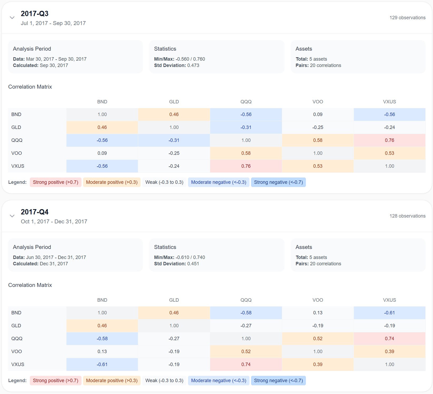
VOO and QQQ ran at 0.58. They moved similarly, but with meaningful independence. VOO and BND sat at 0.09, almost completely uncorrelated. GLD ran negative against both equity ETFs (-0.25 with VOO). This is the textbook picture of a diversified multi-asset portfolio: equities loosely connected to each other, bonds and gold doing their own thing.
Now here's the same combination during Q2 2022, the worst quarter of the year for almost every asset class:
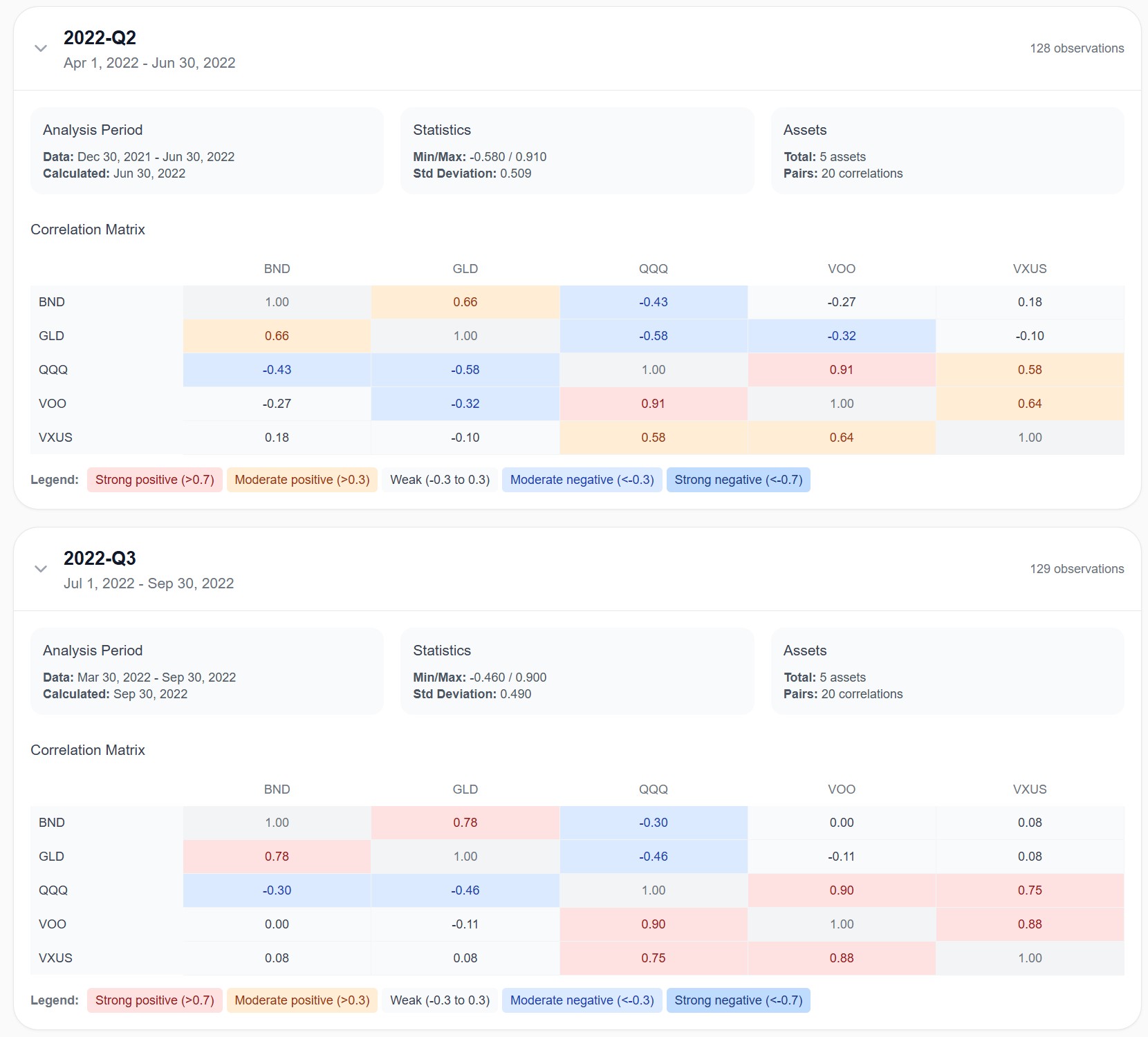
VOO and QQQ jumped to 0.91. They became almost the same position. VOO and BND went to -0.27, but BND was falling alongside stocks, not hedging them, the negative number reflects the synchronized drop in valuation rather than bonds providing protection. GLD and BND, normally weakly linked, became positively correlated at 0.66, and stayed there at 0.78 the following quarter. The "diversified" portfolio of 2017 was suddenly five highly-correlated risk assets, all sliding together.
That's why static correlation analysis is misleading. Looking at one number for the past 10 years tells you the average. It tells you almost nothing about how your portfolio will behave in the regime that matters most: the bad one.
This is the reason we built Awalyt's correlation analysis on a quarterly recalculation, not a single static value. Correlations shift with macro regimes, inflation prints, rate decisions, geopolitical shocks, and the portfolio that looked diversified in 2017 didn't behave diversified in 2022. The structure has to be measured as it evolves, not as a single average that hides the volatility of correlation itself.
The chart below makes the point even clearer. It shows the rolling correlation between SPY and a set of common ETFs across roughly 13 years:
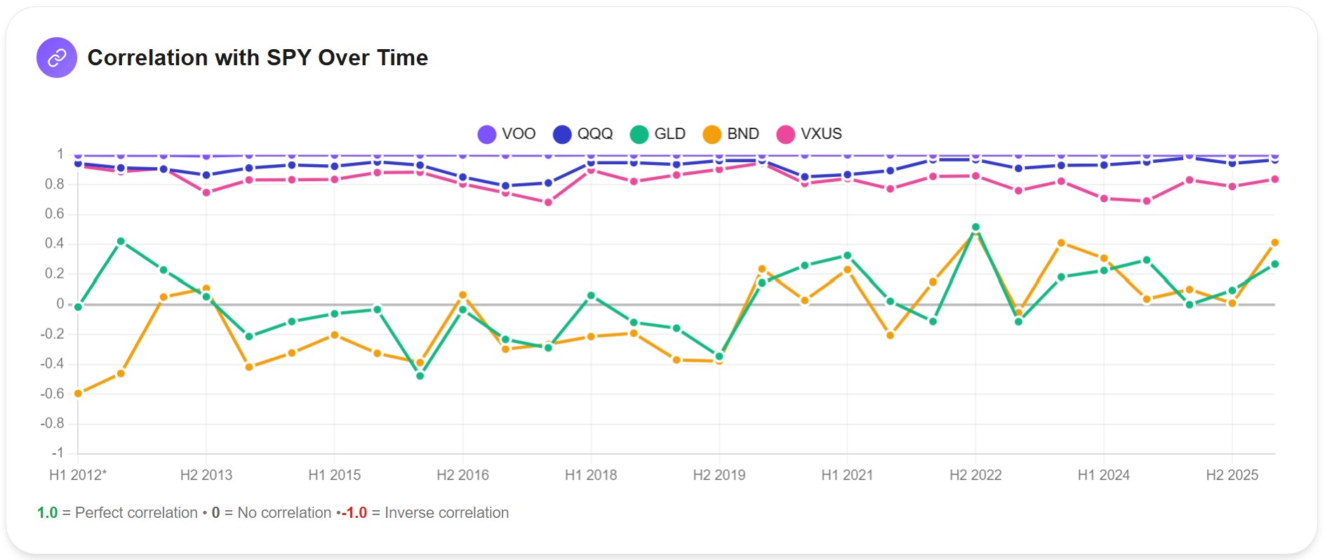
VOO sits at 1.0 throughout. It tracks SPY almost perfectly, since it's functionally the same index. QQQ runs in the 0.85 to 0.95 range, never offering meaningful diversification against the broad US market. VXUS sits between 0.7 and 0.9, adding international exposure helps less than most investors think during US sell-offs.
The interesting story is BND. From 2012 to roughly 2020, BND was negatively correlated with SPY most of the time, sometimes as low as -0.6. That's what people mean when they say "bonds hedge stocks." But starting in 2022, BND's correlation with SPY climbed sharply, peaking near +0.4 in late 2022. The bond market wasn't broken. The macro regime had changed. Rising rates pushed both bonds and stocks down at the same time, breaking decades of inverse behavior.
GLD moves on its own logic, oscillating between roughly -0.5 and +0.5 with no clear pattern. That irregularity is, paradoxically, what makes it a real diversifier — but only when its move direction happens to be the right one in a given period.
The lesson from this chart isn't "buy gold" or "avoid bonds." It's that correlation is dynamic, and the macro regime determines what diversification means in practice.
Layer 3: Sector and Macro Exposure
The third layer catches what the first two can miss: aggregate concentration. Even if your ETFs have moderate overlap and moderate correlation, you might still be massively concentrated in one sector once you sum across the whole portfolio.
The clearest example is tech exposure. Compare VOO and QQQ at the sector level:
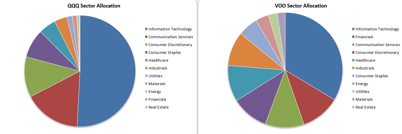
VOO sits at roughly 30% Information Technology. QQQ is closer to 50%, with another large slice in Communication Services that's mostly Alphabet and Meta, also tech-adjacent. If you hold 50% VOO and 50% QQQ, your aggregate tech exposure is around 40%. Add VGT, which is essentially 100% tech, and the number climbs higher fast. A portfolio that "feels" diversified across three ETFs can easily be more concentrated in technology than someone holding a single broad-market fund.
The same problem appears in geography (US-heavy portfolios that think they're global), market cap (large-cap-heavy portfolios that exclude most of the market), and style (growth-tilted portfolios that under-weight value). The fix isn't to count ETFs. It's to look at the aggregate composition and check that no single sector, region, or factor is dominating the portfolio without your intent.
Why This Matters: The Effect on Volatility
All of this, overlap and correlation and sector aggregation, translates into one practical outcome that you actually feel as an investor: portfolio volatility.
A truly diversified portfolio has lower volatility than the weighted average of its components. That's the mathematical definition, and it shows up directly in the numbers Awalyt calculates for any portfolio you build:
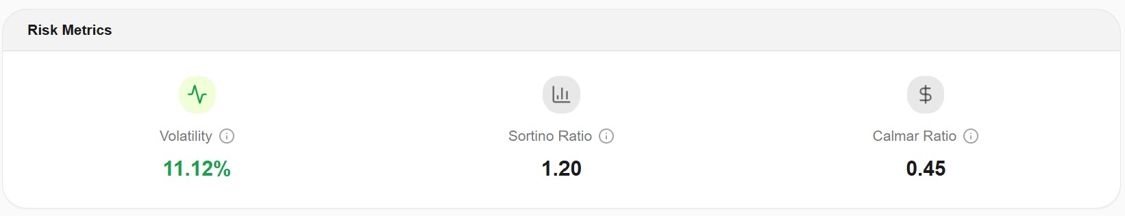
The 11.12% annualized volatility figure above isn't a magic number. It depends on the portfolio. But it's a useful benchmark. A 100% VOO position would run closer to 16-18% annualized volatility. A 100% QQQ position would push above 20%. The diversified mix, properly constructed, lowers that figure substantially without giving up most of the long-term return. Volatility is only one of the numbers worth checking, though; if you want to measure the full risk picture — drawdown, correlation, and risk-adjusted return alongside it — see our guide on the best way to analyze portfolio risk.
Investors who own four ETFs that are all 40% tech will report similar volatility to a single tech-heavy ETF. Same drawdowns, same panic moments, same recovery profile. The "diversification" is on paper only.
The Macro Layer: Why Correlation Changes
This is the deepest point and the one most investors never internalize. Correlations between asset classes are not constants. They depend on the macro regime.
In the post-2008 environment, central banks ran ultra-loose monetary policy, inflation stayed low, and the standard 60/40 stock-bond portfolio worked beautifully. Bonds and stocks moved opposite to each other most of the time. Diversification "worked" because the macro setup supported it.
In 2022, that flipped. Inflation surged. Central banks raised rates rapidly. Both stocks and long-duration bonds repriced lower at the same time. The 60/40 portfolio had its worst year in over four decades, not because the strategy was wrong but because the macro regime no longer supported the inverse correlation it depended on.
Going forward, no one knows which regime dominates the next decade. What we do know is that a portfolio measured only in stable periods will always look more diversified than it actually is in the regime that matters. The discipline is to test the structure across multiple regimes, 2008, 2020, 2022, and see how the correlation matrix shifts.
How to Measure Diversification: A Practical Framework
If you want to actually check your portfolio rather than guess, here's the workflow I'd run.
First, calculate weighted holdings overlap between every major pair of equity ETFs in your portfolio. As a rough rule, anything above 50% on a major pair means you're duplicating exposure rather than diversifying it. This is the easy layer to fix: drop redundant funds, keep the cheaper one.
Second, calculate pairwise correlation between your major positions, ideally on a rolling basis. A single 10-year average is comforting but misleading. What matters is the correlation in stress periods. A pair that runs 0.50 on average but spikes to 0.90 in every drawdown isn't really diversified when you need it most. For a worked example of this on a real holding, see whether a VOO + QQQ + SCHD + VWO + VXUS portfolio is actually diversified once you run the correlations across fourteen years.
Third, check aggregate sector and geographic exposure. Sum across your full portfolio. If any single sector is over 35% without explicit intent, or any single country (usually the US) is over 70%, you're concentrated in ways that may not show up in the ticker list.
Awalyt's AI portfolio analyzer runs all three of these layers automatically against any portfolio you load. It surfaces the hidden concentrations, the regime-sensitive correlations, and the overlap patterns that are easy to miss when reading top-10 holdings lists by hand. You can also run the backtesting tool to see how the same portfolio would have behaved across different macro regimes — 2008, 2020, 2022 — using daily-precision data.
Bottom Line
Diversification is not a count of tickers. It's a measure of how independently your assets behave, across the regimes that actually matter, including the bad ones. Holdings overlap, dynamic correlation, and aggregate sector exposure are the three layers that tell you whether the portfolio you've built actually does what you assumed it does.
The portfolio with five ETFs that are all 40% tech isn't diversified. The portfolio with three ETFs across stocks, bonds, and gold, if measured across regimes and not just calm ones, usually is. The difference shows up in the volatility numbers, in the drawdown depths, and in the speed of recovery after shocks.
If you've been thinking "I have several ETFs, so I'm diversified," the next step is to check. The numbers are easy to calculate, and they will probably surprise you.
Key Takeaways
- Diversification is measured, not assumed. Owning multiple ETFs guarantees nothing.
- Three layers matter: holdings overlap for equity ETFs, correlation for cross-asset analysis, and sector and geographic aggregate exposure for portfolio-wide concentration.
- Correlations are not static. The same portfolio can look diversified in one regime (2017) and highly concentrated in another (2022). Quarterly recalculation reveals what averages hide.
- True diversification shows up in lower volatility and shallower drawdowns, not in the number of tickers held.
- The practical workflow: check pairwise overlap, check rolling correlation, check sector aggregates.
Want to test these insights on your own portfolios?
Awalyt is a portfolio analysis platform: backtesting on daily data, fundamental analysis, asset analysis, and AI-powered insights.
Get Started FreeRelated Insights
Is VOO + QQQ + SCHD + VWO + VXUS Diversified? [2026]
10 min read
How 15% Gold Turned an Aggressive Tech Portfolio into a Market-Beating Strategy
11 min read
The Best Way to Analyze Portfolio Risk [2026]
11 min read