Is Your Portfolio Really Diversified? How to Check [2026]
Count the ETFs in your brokerage account. If the number is five or six, you probably feel reasonably safe. More funds, more spreading out, less chance any single thing sinks you. That's the instinct, and it's wrong often enough to be worth checking.
The question that actually matters isn't how many funds you hold. It's how many of them do something different when the market moves. You can own five funds that are, for every practical purpose, the same fund. And you usually don't find out until the one thing they all depend on stops working.
So how do you tell the difference? There are three checks, and they get progressively harder to fool. I'll run all three on a real portfolio.
This article is for educational purposes only and is not financial advice. Past performance doesn't guarantee future results. Figures come from historical backtests and correlation analysis; your own portfolio and results will differ.
The portfolio that looks diversified
Here's a portfolio I see versions of constantly, usually from people who've done some reading and want to build something smarter than a single index fund:
- VOO: the S&P 500 core
- QQQ: Nasdaq / growth exposure
- VGT: the technology sector
- VUG: a growth tilt
- SCHD: dividends and value, the diversifier
Equal weight, 20% each. Five tickers, five mental jobs. On paper it looks balanced: a broad core, some growth, a sector bet, a value counterweight. Watch what happens to that story when you actually measure it.
Check 1: overlap — different tickers, same stocks
The first and easiest check is literal. Do your funds hold the same stocks? You can answer this for free with an ETF overlap analyzer, no account needed.
Take QQQ and VGT. A lot of people keep these as two separate lines because one is "the Nasdaq fund" and the other is "the tech fund." Run them through the checker:
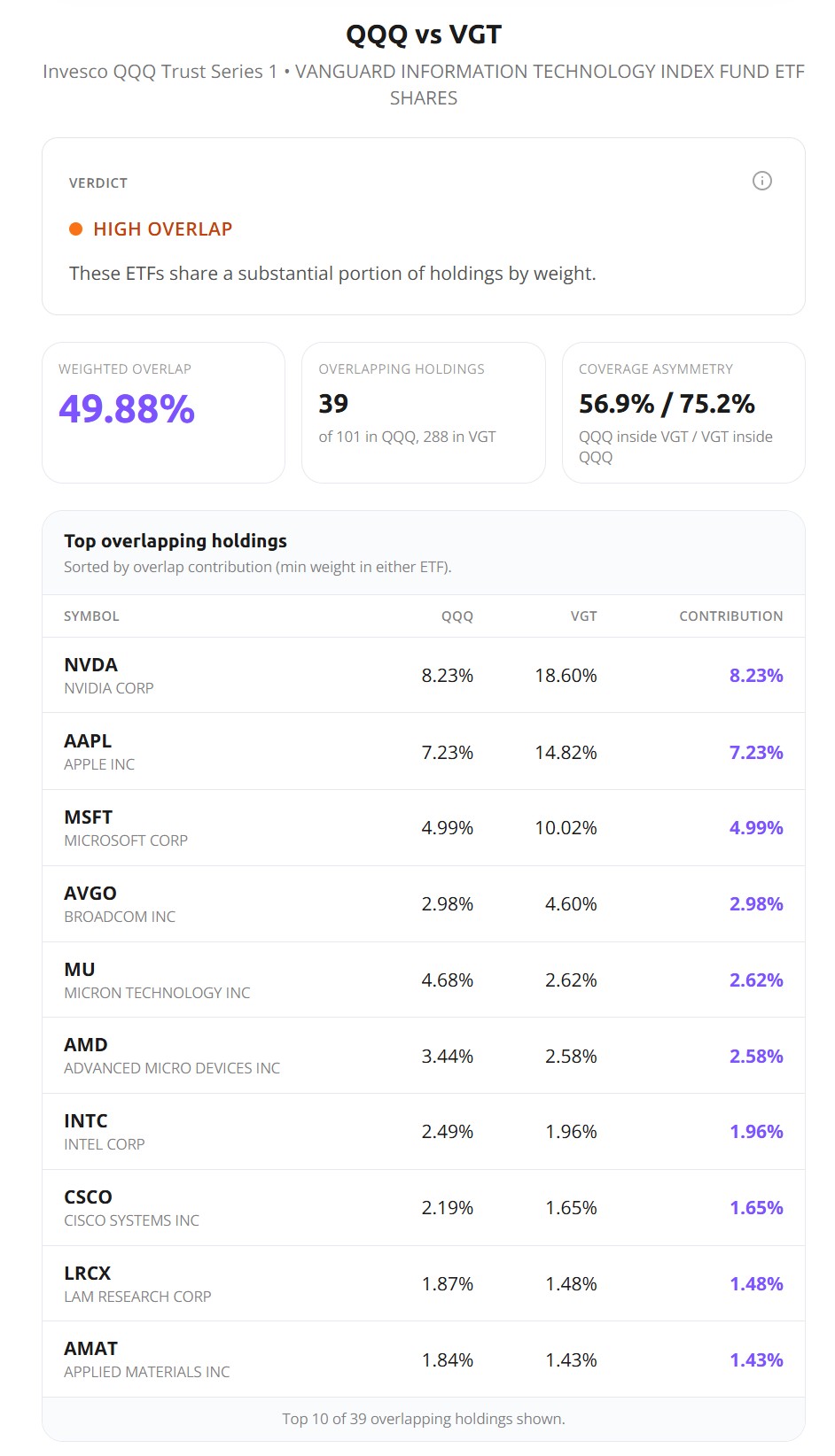
The two funds share 49.88% of their weight. Nearly half of each one is the same handful of stocks: NVDA, AAPL, MSFT, AVGO, and on down the list. Your Nasdaq fund and your tech fund are, by weight, half the same fund. If that surprises you, you're not alone — this is the single most common redundancy I flag in portfolios shared on the Bogleheads forum, and it hides in plain sight because the tickers look unrelated.
Overlap is a good first pass. But it has a hard ceiling. It only catches stocks that two funds literally share. It's blind to two funds that hold completely different stocks and still move in near-unison. A US large-cap fund and a US small-cap fund can have almost nothing in common on paper and still rise and fall together. Overlap scores that as diversified. It isn't. To see it, you need a different number.
Check 2: correlation — the real test
Correlation measures the thing overlap can't: how your funds actually move relative to each other, day by day, regardless of what they hold. Two funds that swing together score near 1.0. Two that move independently score near 0.
Run all five funds through the diversification analysis in Awalyt's AI Insights:
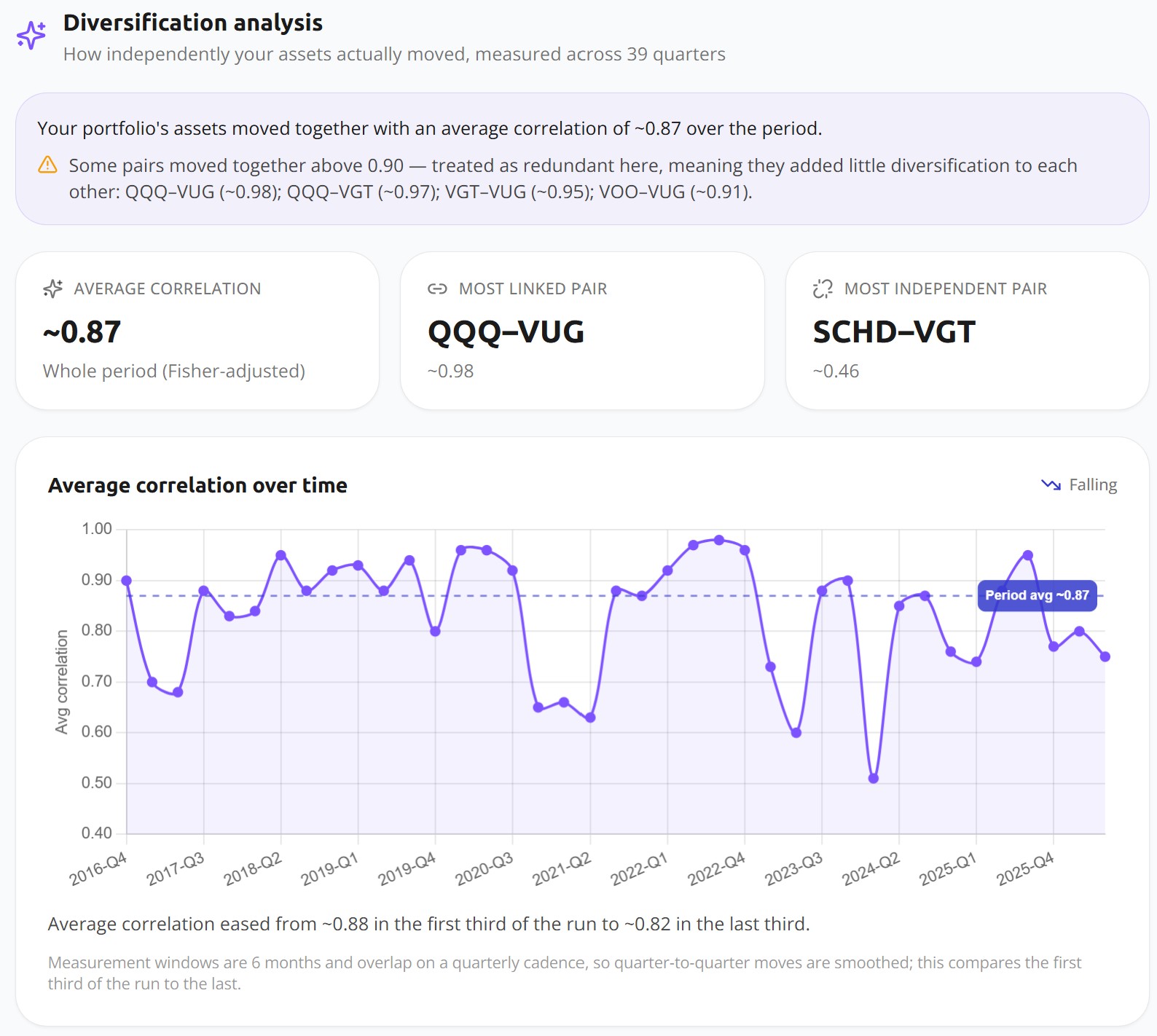
The average correlation across the portfolio is ~0.87. On a scale where 1.0 is perfect lockstep, that's close to it. Look at the individual pairs and it gets starker: QQQ–VUG at 0.98, QQQ–VGT at 0.97, VGT–VUG at 0.95, VOO–VUG at 0.91. Four of your five funds are, statistically, one fund.
Now connect this back to overlap. QQQ and VGT shared "only" 49.88% of their holdings, yet they correlate at 0.97. Half their stocks are literally different, and they still move almost identically, because the shared half is the half that drives the returns. Overlap saw 50% and shrugged. Correlation saw the truth. That's why correlation, not overlap, is the number that tells you how independent your holdings really are.
The one exception is SCHD. Its most independent pairing, SCHD–VGT, sits at ~0.46. In this whole portfolio, SCHD is the only fund doing real diversification work. One out of five. Everything else is a variation on the same large-cap growth bet. (This is also the kind of redundancy I walk through in does VTI make SCHD redundant, from the opposite direction.)
One methodology note: Awalyt computes this on daily returns, and that's deliberate. Correlation measured on monthly data smooths over exactly the short, sharp windows where funds either hold together or come apart. Which brings us to the part almost nobody checks.
The number that moves: correlation and the regime
That 0.87 is a whole-period average. Averages hide behavior, and correlation has a lot of behavior to hide. Look at the "average correlation over time" line in that same screenshot: it swings from roughly 0.50 in some quarters up to 0.98 in others. The diversification you have depends heavily on when you measure it.
Here's where it bites. In calm markets, SCHD keeps some distance from the growth funds. In a selloff, that distance collapses. Compare two quarters of 2022:
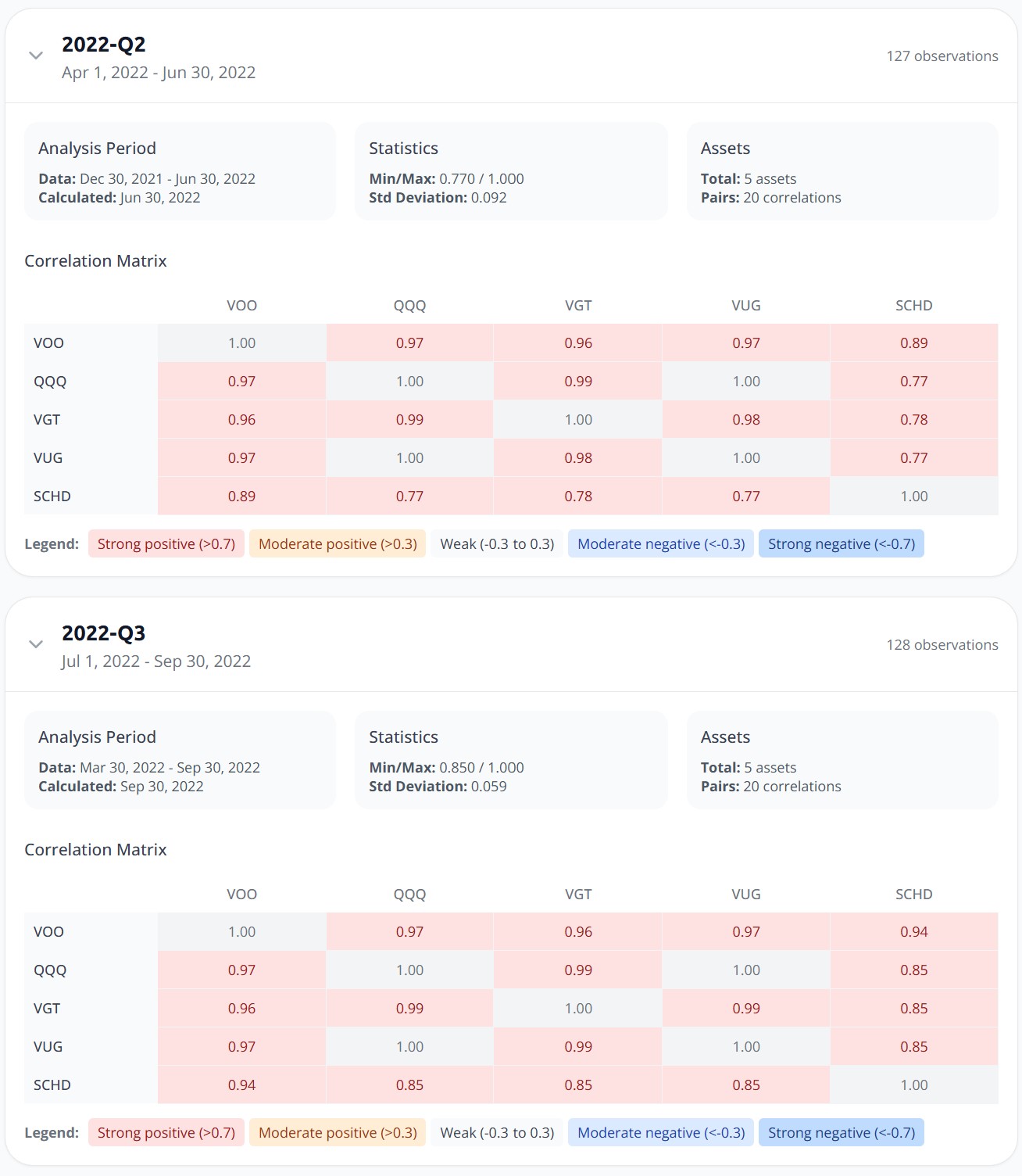
In 2022-Q2, SCHD correlated between 0.77 and 0.89 with the other four funds. By 2022-Q3, as the bear market deepened, those numbers climbed to 0.85 to 0.94. VOO–SCHD went from 0.89 to 0.94. SCHD–VGT, which averages ~0.46 across the full decade, ran at 0.85 through the worst of the 2022 drawdown.
Read that again: your one diversifier provided the least diversification precisely when the portfolio was falling hardest. This isn't specific to SCHD. It's the general behavior of markets under stress — correlations rise in crashes. Assets that look independent when everything's calm tend to move together the moment everyone reaches for the exit at once. A single static correlation number will never warn you about this. You have to look at how it behaves across regimes, which is the whole reason daily-resolution data matters here. Monthly data blurs the exact windows where the answer changes.
Check 3: does it show up in a real drawdown?
Overlap and correlation are diagnostics. The backtest is the verdict. Run the five-fund portfolio through a daily backtest over the last ten years and see what the concentration actually did.
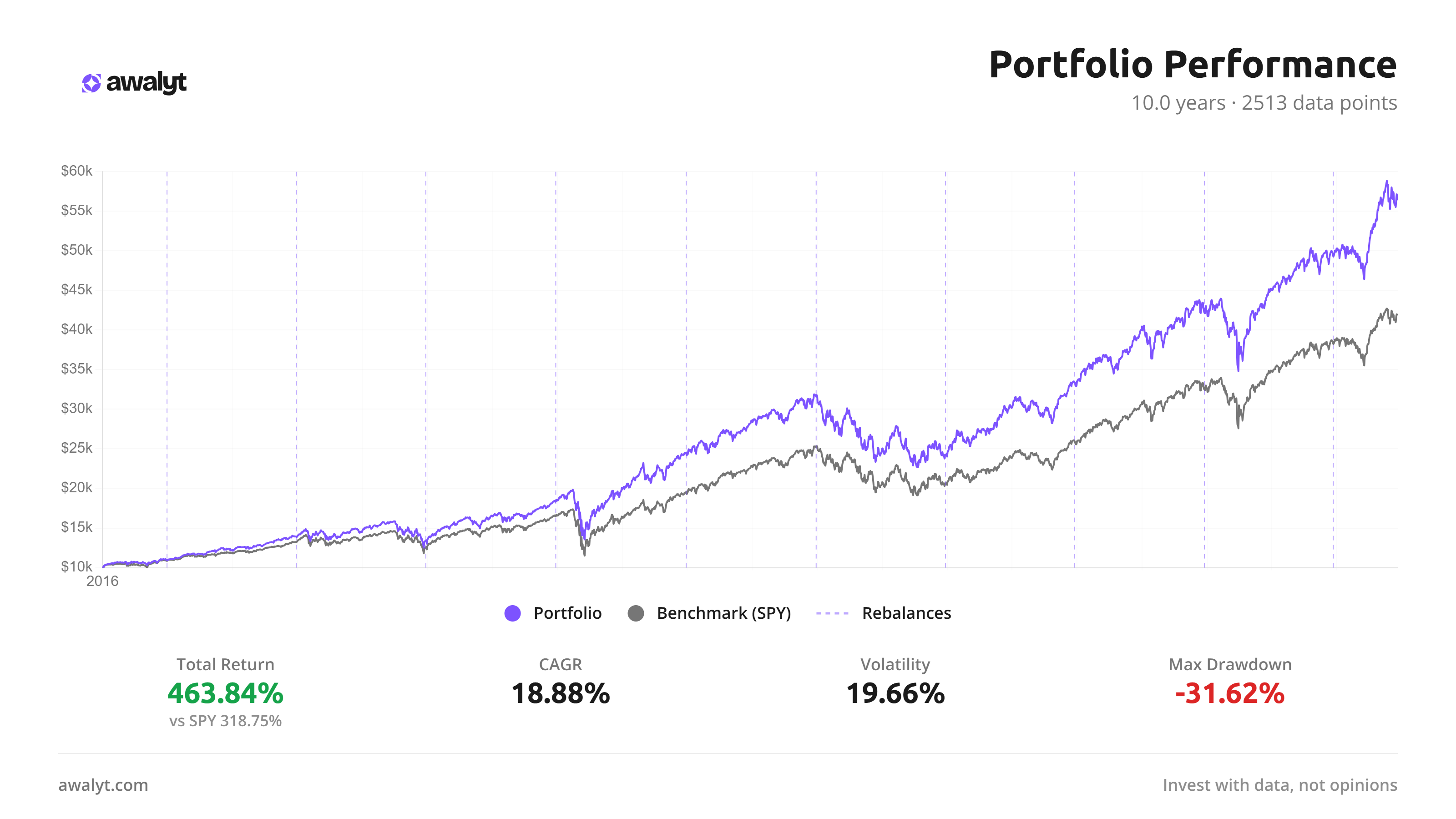
And here's the twist, because it's the opposite of a gotcha: this portfolio won. 463.84% total return against 318.75% for the S&P 500. If you'd built it in 2016, you'd be very pleased with yourself right now.
But read the rest of the line. Volatility of 19.66%, higher than the index. A max drawdown of -31.62%. And in the 2022 bear market, the portfolio lost -23.84% for the year while the S&P 500 fell around -18%. The concentration that supercharged the good years amplified the bad one.
So the portfolio was never diversified. It was a concentrated bet on US large-cap growth that happened to pay off across this particular decade. That's the real trap. The returns look like the reward for smart diversification. They're the reward for concentration the owner didn't know they were carrying.
This is the part that genuinely worries me about portfolios like this, and it isn't the returns. It's that the owner believes they're holding something balanced. So when 2022 arrives and the whole thing drops nearly a quarter of its value in a year, it feels like something broke. Nothing broke. It did exactly what a concentrated growth bet does in a growth selloff. But the investor who thought they owned five different things is the one most likely to sell at the bottom, because the portfolio just did something they didn't sign up for.
So what does "really diversified" look like?
Not more funds. Adding a sixth growth ETF to this portfolio changes nothing — you'd just own the same bet in a slightly different wrapper. The fix is adding something that does a different job when the market turns, and the only way to know whether it does is to check its correlation to what you already own. Not its name, not its category label. Its correlation.
Maybe your version of this portfolio holds bonds, or international, or gold. Good. Run the correlation check and see whether they actually pull the average down, or whether they've quietly drifted up toward everything else during the last couple of drawdowns. You might find one real diversifier carrying the whole load, the way SCHD does here. You might find none.
The three checks stack. Overlap tells you which funds are literally the same. Correlation tells you which ones move the same even when they're not. The backtest tells you what that combination did the last time markets actually tested it. Any one of them can be fooled. Together they're hard to argue with.
Bottom line
Diversification was never a count. It's whether the things you own can fall out of step when it counts, and the number on your brokerage screen says nothing about that. Five funds that rise together fall together. The correlation between them tells you everything the fund count can't.
Run your own portfolio through the three checks. And if your core is an S&P 500 or total-market fund, the next thing worth measuring is how concentrated that single holding already is before you add anything on top of it. That's usually where the surprises start, and it's a good reason to read what portfolio diversification actually means before you decide you already have it.
Want to test these insights on your own portfolios?
Awalyt is a portfolio analysis platform: backtesting on daily data, fundamental analysis, asset analysis, and AI-powered insights.
Get Started FreeRelated Insights
What Is Portfolio Diversification? (And How to Measure If You Actually Have It) [2026]
13 min read
How 15% Gold Turned an Aggressive Tech Portfolio into a Market-Beating Strategy
11 min read
The Best Way to Analyze Portfolio Risk [2026]
11 min read
Is VOO + QQQ + SCHD + VWO + VXUS Diversified? [2026]
10 min read
VOO + SMH: More Tech, or Real Diversification? [2026]
10 min read
How Many ETFs Do You Really Need? 12 Years of Data Have the Answer.
9 min read