Daily vs Monthly Data in Backtesting — Does It Matter? [2026]
You run a backtest on your portfolio. The tool says your max drawdown was -19%. You think: "I can handle that." You invest. Then the market drops, your portfolio falls -31% in three weeks, and you panic-sell at the bottom.
What happened? The backtest wasn't wrong — it just wasn't showing you the full picture. It was using monthly data.
This is one of the most important and least discussed accuracy problems in portfolio backtesting. The data frequency your tool uses — daily vs. monthly — doesn't just change a few decimal points. It changes whether you see the real risk of your portfolio or a smoothed-out, more optimistic version of it.
Let's look at exactly how much it matters, with real numbers.
Disclaimer: This article is for educational and informational purposes only. It does not constitute investment advice. Past performance does not guarantee future results. Always do your own research before making any investment decisions.
What Does "Data Frequency" Mean in Backtesting?
When a backtesting tool runs a simulation, it needs historical price data for every asset in your portfolio. The question is: how often does it sample that data?
Monthly data means the tool records one price per asset per month — typically the closing price on the last trading day. That gives you 12 data points per year. Everything that happens between those monthly snapshots is invisible to the simulation.
Daily data means the tool records the closing price for every trading day. That's roughly 252 data points per year — a 21x increase in resolution.
Think of it like watching a basketball game through 12 photos taken once a month versus watching the full video. The final score is the same in both cases. But if you want to know what actually happened during the game — the runs, the momentum shifts, the critical plays — you need the video.
Where the Numbers Agree: Returns
Here's what makes this problem so subtle. If you run the same portfolio through daily and monthly data over the same time period, the return metrics will be nearly identical.
CAGR (compound annual growth rate) is calculated from the starting value and ending value. Since both daily and monthly tools use the same start and end dates, they arrive at essentially the same return number. Total return, similarly, will be within a fraction of a percent.
This is why most investors never notice the difference. The headline number — "my portfolio returned 17% per year" — looks the same regardless of data frequency. And if returns are the only thing you're looking at, it genuinely doesn't matter which tool you use.
But returns are only half the story. The other half is risk.
Where the Numbers Diverge: Risk Metrics
Risk metrics are calculated from the path your portfolio takes between the start and end dates — not just the endpoints. And that's exactly where daily and monthly data tell very different stories.
Let's use a real example. Here's a tech-tilted growth portfolio we ran through Awalyt's backtesting engine using daily data over 14 years (2012–2026):
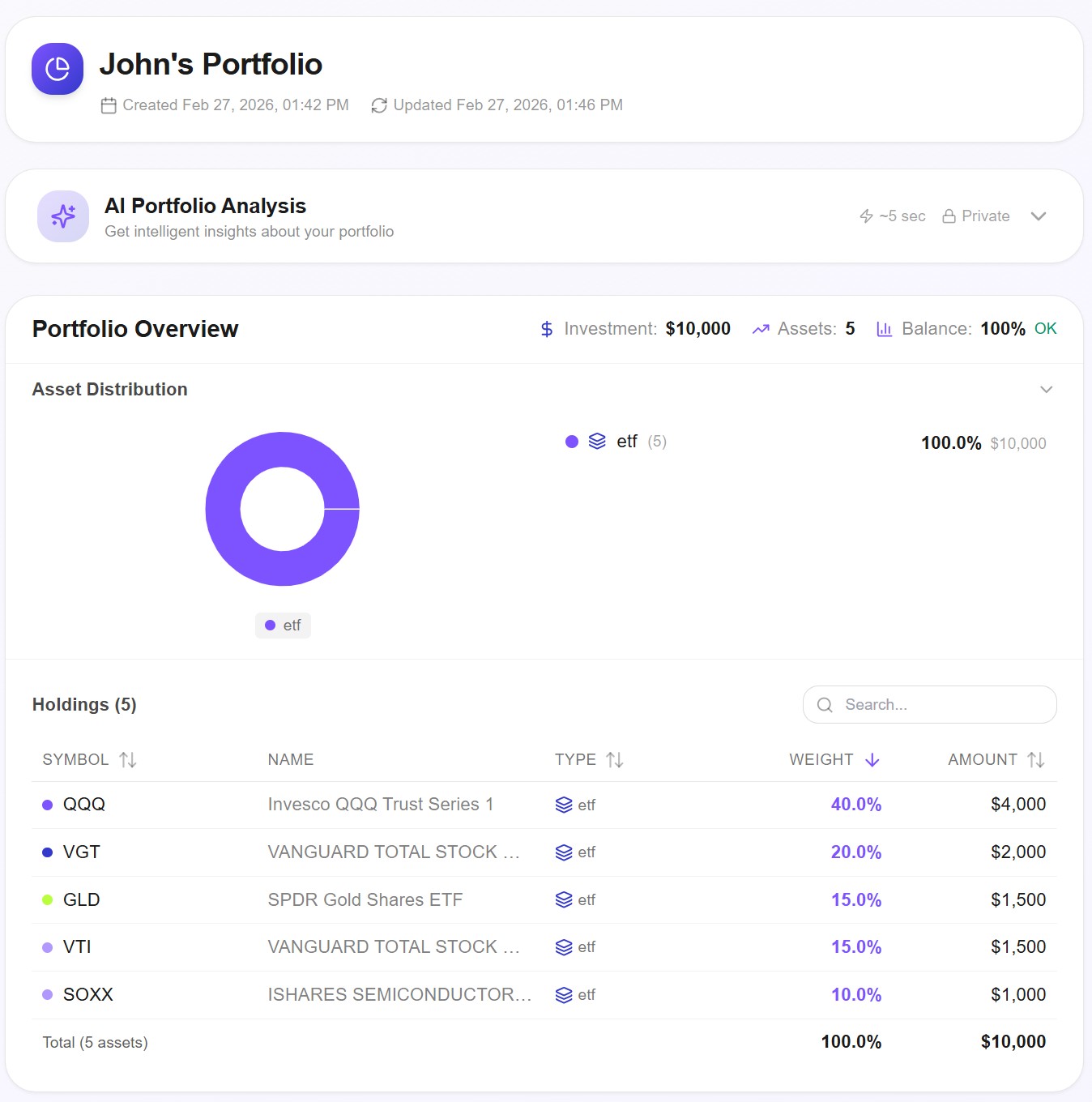
The allocation is 40% QQQ (Nasdaq 100), 20% VGT (Information Technology), 15% GLD (Gold), 15% VTI (Total US Market), and 10% SOXX (Semiconductors). It's deliberately tech-heavy — the kind of portfolio that experiences sharp intra-month swings that monthly data tends to smooth away.
Here are the results with daily data — 3,520 data points across 14 years:
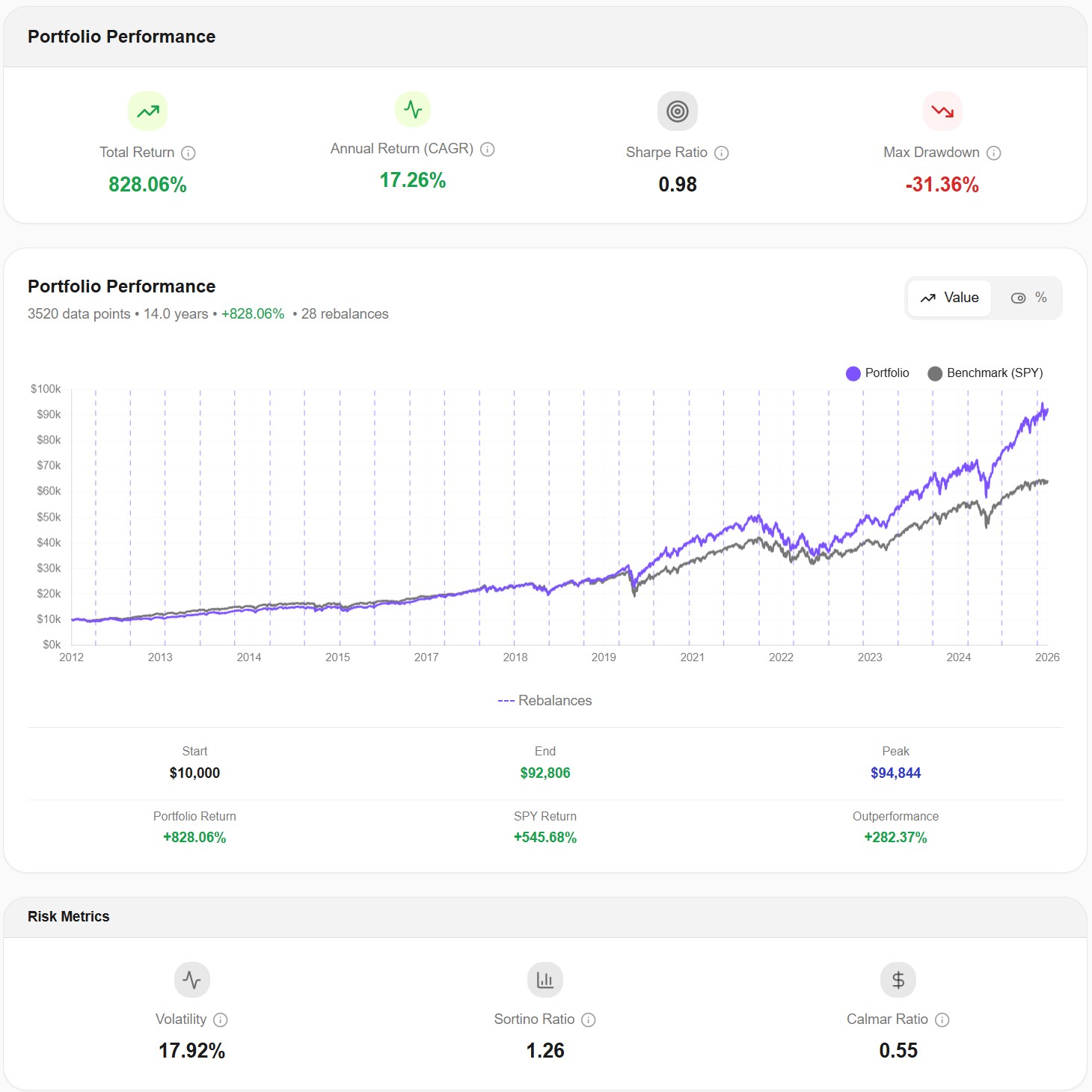
| Metric | Daily Data (252 pts/year) |
|---|---|
| Total Return | +828.06% |
| CAGR | 17.26% |
| Max Drawdown | -31.36% |
| Volatility | 17.92% |
| Sharpe Ratio | 0.98 |
| Sortino Ratio | 1.26 |
| Calmar Ratio | 0.55 |
Now, what would monthly data show for the same portfolio over the same period?
The CAGR would be virtually identical — around 17%. But the risk metrics would shift significantly. Monthly data typically understates max drawdown by 20–40% for equity-heavy portfolios, because it only sees where the portfolio stood at month-end, not where it fell during the month. For this portfolio, a monthly tool would likely report a max drawdown somewhere around -20% to -24%, instead of the actual -31.36%.
That's not a rounding error. That's the difference between thinking "I'd lose about a fifth of my portfolio in the worst case" and knowing "I'd lose almost a third."
The COVID Crash: A Perfect Case Study
March 2020 is the single best example of why data frequency matters.
The S&P 500 dropped over 30% in just 23 trading days — from February 19 to March 23. It then recovered roughly 8% by the end of March. A monthly data tool sees the February month-end price, then the March month-end price, and records the difference. The intra-month collapse and partial recovery are compressed into a single data point.
For our tech-heavy portfolio, look at what daily data captured:
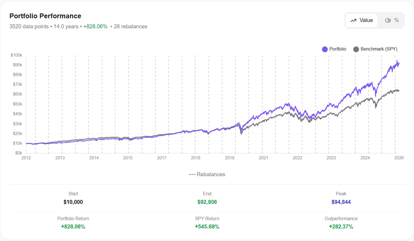
Look at the 2020 section of this chart. The daily line shows a steep, V-shaped drop — the actual experience of holding this portfolio during COVID. A monthly chart would show a gentle dip, almost as if nothing particularly dramatic happened between February and April.
The volatility chart tells the same story even more clearly:
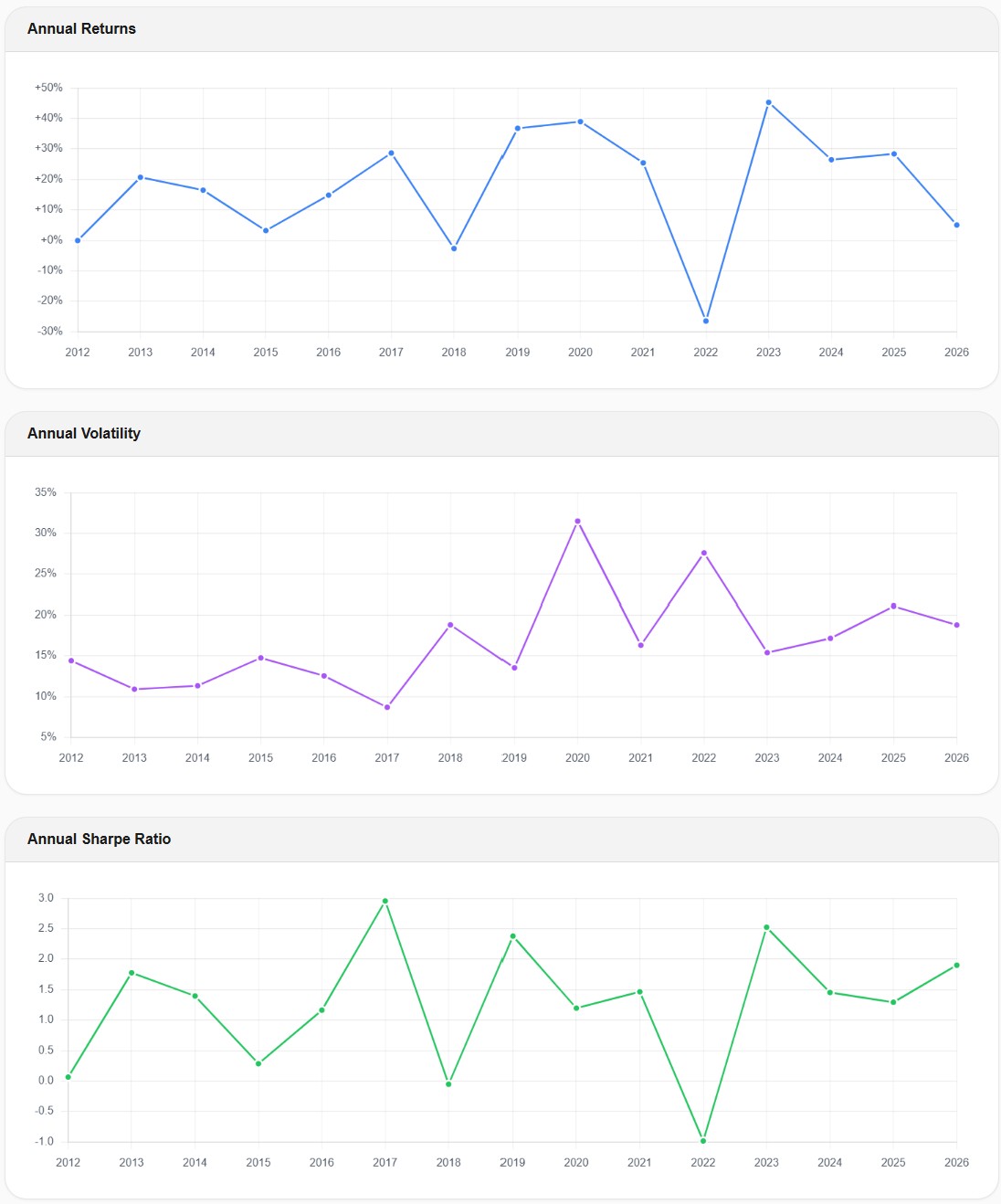
Annual volatility jumped from around 9% in 2017 to over 31% in 2020 — more than tripling. By 2023, it had settled back to around 15%. This spike is critical information. If you're stress-testing your portfolio, you need to know that your "17% average volatility" portfolio can temporarily become a 31% volatility portfolio during a crisis. Monthly data captures some of this spike, but significantly underestimates its magnitude because it's measuring month-to-month changes rather than day-to-day swings.
Why CAGR Stays the Same but Sharpe Ratio Doesn't
This is the part that confuses most investors, so let's be precise about it.
CAGR is calculated as: (End Value / Start Value)^(1/years) - 1. It only needs two numbers — the starting value and the ending value. Whether you sampled daily or monthly in between doesn't change those two endpoints. So CAGR is essentially identical regardless of data frequency.
Volatility is calculated from the standard deviation of periodic returns. With monthly data, you calculate 12 monthly returns per year and compute their standard deviation. With daily data, you calculate 252 daily returns per year. The daily returns capture every sharp movement — the -7% days, the +5% recovery days — that monthly returns average away. More variation in the inputs means higher measured volatility.
Max drawdown is the largest peak-to-trough decline. With monthly data, you can only see the deepest trough that happened to land on a month-end date. If the real bottom occurred mid-month and the portfolio partially recovered by month-end, the monthly tool shows a shallower drawdown. Daily data catches the actual bottom, whenever it occurred.
Sharpe ratio is return divided by volatility. Since return stays the same but daily-measured volatility is higher, the Sharpe ratio calculated from daily data is lower — meaning the risk-adjusted return looks less impressive. This isn't because the portfolio is worse. It's because daily data gives you a more honest measure of the volatility you actually experienced.
In short: daily and monthly data agree on how much money you made. They disagree — sometimes dramatically — on how much risk you took to make it.
The 2022 Bear Market: When Correlations Broke
The 2022 bear market adds another dimension to the daily vs. monthly data debate: correlations.
In 2022, stocks and bonds fell simultaneously — something that historically happened rarely. Many investors holding a "diversified" 60/40 portfolio were shocked to see both sides of their allocation declining at the same time.
Daily data makes this correlation breakdown visible in near real-time. On Awalyt, the quarterly correlation matrix tracks how the relationships between your holdings evolve over time:
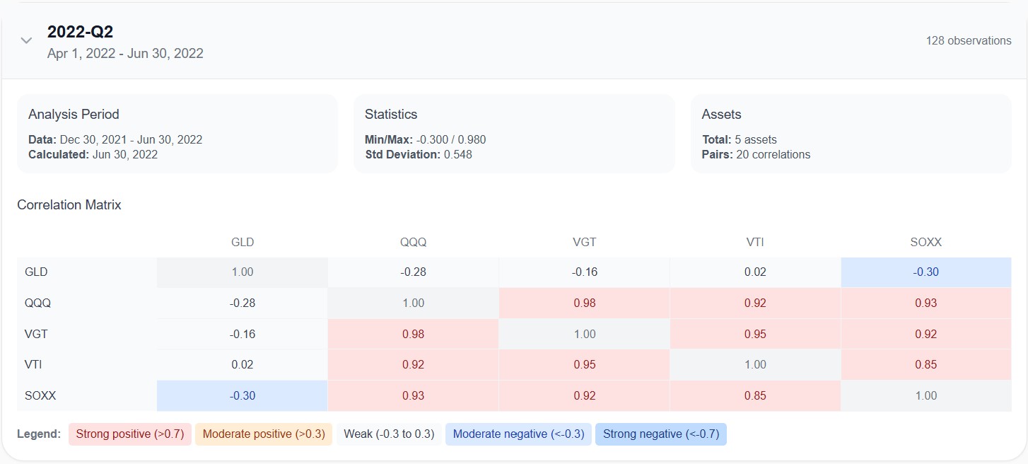
This Q2 2022 snapshot shows the correlations calculated from 128 daily observations. QQQ, VGT, VTI, and SOXX were all moving almost in lockstep — correlations between 0.85 and 0.98. GLD was the only asset providing genuine diversification, with negative correlations across the board (-0.28 to QQQ, -0.30 to SOXX).
A monthly correlation matrix for the same period would use just 6 data points. Six. That's statistically meaningless. You can't draw reliable conclusions about how assets move together from six observations. Daily data gives you 128 observations for the same quarter — enough to see the actual relationship with reasonable confidence.
This matters for portfolio construction. If your tool shows you a single average correlation number calculated from monthly data across the entire backtest period, you're seeing a blended average that hides exactly the moments when correlations spike — which tend to be the moments when diversification matters most.
What About Sharpe Ratio? The Annualization Problem
There's a technical subtlety that's worth understanding if you compare Sharpe ratios across tools.
When a tool calculates the Sharpe ratio from monthly returns and then annualizes it, the formula multiplies by √12 (square root of 12 months). When it calculates from daily returns, it multiplies by √252 (square root of 252 trading days).
This annualization step can produce different results even if the underlying risk-adjusted performance is identical. The daily-calculated Sharpe tends to be lower because daily returns contain more noise — which is real volatility that monthly sampling misses.
Our portfolio shows a Sharpe ratio of 0.98 with daily data. A monthly-data tool might report something closer to 1.10 or 1.15 for the same portfolio. Neither number is "wrong" — but the daily version gives you a more conservative, and arguably more honest, picture of risk-adjusted performance.
The takeaway: when comparing Sharpe ratios across tools, always check whether they're using daily or monthly data. Comparing a daily Sharpe from one tool against a monthly Sharpe from another is like comparing kilometers to miles — the numbers look different, but they might be describing the same thing.
Which Metrics Are Affected Most?
Not all metrics are equally sensitive to data frequency. Here's a practical ranking:
Highly sensitive to data frequency (daily data makes a big difference):
- Max drawdown — the most affected metric. Monthly data can understate drawdowns by 20–40% for volatile portfolios.
- Volatility — daily data consistently shows higher volatility because it captures intra-month swings.
- Sharpe and Sortino ratios — since volatility is in the denominator, higher measured volatility means lower ratios.
- Correlation matrices — monthly data provides too few data points per quarter for reliable correlation estimates.
Moderately sensitive:
- Calmar ratio (CAGR / max drawdown) — affected through the drawdown component.
- Rolling metrics (rolling returns, rolling Sharpe) — daily data produces smoother, more granular rolling windows.
- Upside/downside capture ratios — affected by how precisely the tool identifies "up" and "down" periods.
Minimally sensitive (daily vs. monthly makes little difference):
- CAGR and total return — determined by endpoints, not the path between them.
- Final portfolio value — same reason.
- Asset allocation drift — the drift measured at rebalancing dates is similar regardless of data frequency.
The pattern is clear: anything that measures the journey (risk, volatility, drawdowns, correlations) is significantly affected. Anything that measures the destination (total return, final value) is not.
"But My Tool Shows Monthly Data and the Results Look Fine"
This is the most common pushback, and it's understandable. If you've been using a monthly-data tool and your results look reasonable, why would you switch?
The answer is that monthly data doesn't produce wrong results — it produces incomplete results. The returns are accurate. The max drawdown is mathematically correct for month-end snapshots. The problem is that month-end snapshots don't capture what you'd actually experience as an investor.
Imagine a portfolio that drops -31% over three weeks, then recovers 10% by month-end. The monthly tool records a drawdown of roughly -21%. Your actual experience — watching your $100,000 portfolio hit $69,000 before recovering to $79,000 — was the -31% drop. That's the number that determines whether you stay invested or panic-sell.
If your risk tolerance is built on a -21% max drawdown number, you're making a portfolio decision based on data that understates your actual worst-case scenario by a third. That's not a minor discrepancy — it's the kind of gap that leads to behavioral mistakes when markets get rough.
When Does Monthly Data Work Fine?
To be fair, monthly data isn't always misleading. There are situations where the difference is minor:
Low-volatility, bond-heavy portfolios. If your portfolio is 80% bonds and 20% stocks, the intra-month swings are relatively small, and monthly data captures most of the meaningful movement.
Very long time horizons with a focus on returns. If you're looking at a 30-year backtest and you only care about whether the strategy delivered a reasonable CAGR, monthly data will give you an accurate answer.
Rough screening of asset allocations. If you're comparing a dozen allocation options and just need a first pass to narrow the list, monthly data is fast and directionally correct.
But for any portfolio decision where risk tolerance matters — retirement planning, drawdown-sensitive strategies, or simply understanding whether you can stomach the worst-case scenario — daily data provides a fundamentally more accurate picture. See our breakdown of which backtesting tools use daily vs. monthly data.
How to Interpret Your Backtest Based on Data Frequency
If you're using a monthly-data tool and can't switch, here are practical adjustments:
For max drawdown: Assume the real drawdown is 25–40% worse than what the tool shows for equity-heavy portfolios. If the tool says -20%, plan for -25% to -28%.
For volatility: Expect real daily volatility to be 15–30% higher than the monthly figure. If the tool shows 12% volatility, daily data would likely show 14–16%.
For Sharpe ratio: A monthly Sharpe above 1.0 might correspond to a daily Sharpe of 0.85–0.95. Don't compare monthly Sharpe ratios against daily Sharpe ratios from a different tool.
For correlations: Monthly correlation matrices are directionally useful but statistically weak. Don't make portfolio construction decisions based on monthly correlations from a single time period. At minimum, check how correlations changed across different market regimes.
These aren't precise conversion factors — they vary by portfolio composition and time period. But they'll help you avoid the most dangerous mistake: thinking your portfolio's risk is lower than it actually is.
The Bottom Line
Daily vs. monthly data in backtesting isn't a niche technical debate. It's a fundamental accuracy question that directly affects how much risk you think you're taking — and therefore how you build and stick with your portfolio.
The returns look the same either way. The risk picture does not. Daily data shows you the real drawdowns, the real volatility spikes, and the real correlation breakdowns that monthly data smooths into a more comfortable — but less truthful — narrative.
If you're currently on Portfolio Visualizer and wondering whether the daily-data difference is worth the switch, we've put the two tools side-by-side.
You don't need to understand the math behind annualized standard deviations to act on this. The practical takeaway is simple: if you're making portfolio decisions based on backtested risk metrics, make sure those metrics come from daily data. The difference between a -20% drawdown and a -31% drawdown isn't academic. It's the difference between staying invested and selling at the worst possible time.
All backtest data shown in this article was generated using Awalyt's daily-granularity backtesting engine, which uses 252 data points per year. Past performance does not guarantee future results. This content is educational and does not constitute financial advice.
Want to test these insights on your own portfolios?
Awalyt is a portfolio analysis platform: backtesting on daily data, fundamental analysis, asset analysis, and AI-powered insights.
Get Started FreeRelated Insights
Does Rebalancing Actually Improve Returns? We Tested the All Weather Portfolio Over 16 Years [2026]
13 min read
What Is Portfolio Backtesting? A Complete Guide for DIY Investors [2026]
12 min read
Bogleheads 3-Fund Portfolio vs S&P 500: A 14-Year Backtest with Real Data [2026]
14 min read