How to Tell If a Stock Is Overvalued or Undervalued: A Framework with Real Examples [2026]
Open any investing forum and you'll see the same arguments repeated endlessly. "AAPL is overvalued at 30x earnings." "ADBE is a screaming buy at 14x." "NVDA is a bubble — no way it's worth 38x." The conversations all share the same mistake: they treat the P/E ratio as a single verdict on whether a stock is cheap or expensive.
It isn't. A stock with a P/E of 14 can be a value trap. A stock with a P/E of 38 can be reasonably priced — sometimes even cheap. The number alone tells you almost nothing without context.
This article gives you the framework professional investors actually use to assess whether a stock is overvalued or undervalued. We'll walk through 4 layers of analysis, then apply them to two real companies — Adobe and NVIDIA — that look obvious at first glance and turn out to be more interesting than the headlines suggest.
Disclaimer: This article is for educational and informational purposes only. It does not constitute investment advice. Past performance does not guarantee future results. Always do your own research before making any investment decisions.
Why a Single Number Tells You Nothing
Let's start with the core problem. When most retail investors hear "this stock has a P/E of 14," they think one thing: cheap. When they hear "this stock has a P/E of 38," they think the opposite: expensive. Both intuitions are wrong more often than they're right.
The reason is that a P/E ratio is just price divided by earnings. It tells you what investors are willing to pay today for a dollar of current profit. But that number says nothing about whether those profits are growing or shrinking, whether the business is becoming more or less efficient, or whether the company today is fundamentally different from the company that earned a similar P/E five years ago.
A useful way to think about valuation is to combine two dimensions: how does the current price compare to history? and how are the fundamentals trending? That gives you four possible patterns:
| Valuation (vs. history) | Fundamentals | What it usually means |
|---|---|---|
| Cheap | Stable or improving | Potentially undervalued |
| Cheap | Deteriorating | Value trap |
| Expensive | Stable or improving | Premium for quality (often justified) |
| Expensive | Deteriorating | Potentially overvalued |
The key insight is that "cheap" and "expensive" are meaningless without the second column. A stock can look cheap and be a trap. A stock can look expensive and be a bargain. To know which one you're looking at, you need a structured framework — not a gut reaction.
The 4-Layer Valuation Framework
Here's the framework I use to assess any stock in about 10 minutes. It has 4 layers, and each one answers a different question.
Layer 1 — Historical valuation context. How does today's P/E compare to the stock's own historical average? This is more useful than comparing across companies or sectors, because it removes industry noise and tells you whether the market is pricing this specific business more or less generously than it has in the past.
Layer 2 — Profitability quality. Are the company's gross, operating, and net margins stable, improving, or deteriorating? Margins are the cleanest signal of business health. A company can grow revenue while destroying margins (bad), or grow revenue while expanding margins (great).
Layer 3 — Growth trajectory. Are revenue, earnings, and free cash flow growing, flat, or declining? Annual snapshots can be misleading — what matters is the rolling trend over multiple years.
Layer 4 — Returns on capital. Are ROE and ROA stable, improving, or deteriorating? These tell you how efficiently the business turns capital into profit. A company with rising ROE is becoming more efficient. A company with falling ROE is becoming less efficient — even if its revenue is growing.
When all 4 layers point in the same direction, you have a clear signal. When they diverge, you have an interesting story — and that's where most of the real opportunities (and traps) hide.
Let's apply this to two real companies.
Case Study 1 — Adobe (ADBE): When "Cheap" Actually Means Cheap
Adobe is the dominant player in creative software, document management, and digital marketing. It's also one of the most beaten-down large-cap tech stocks of the last 18 months, down significantly from its 2021 highs. The market is treating it like a company in decline.
Is the market right?
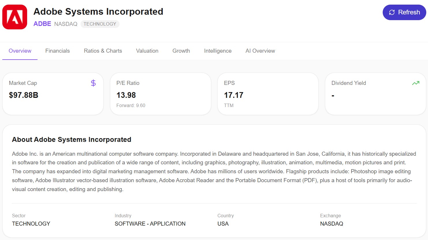
The headline numbers: market cap around $98B, trailing P/E of 13.98, forward P/E of 9.60, EPS of $17.17. For a software company with 88% gross margins, those valuation numbers look unusual at first glance. Let's go through the 4 layers.
Layer 1: Historical valuation context
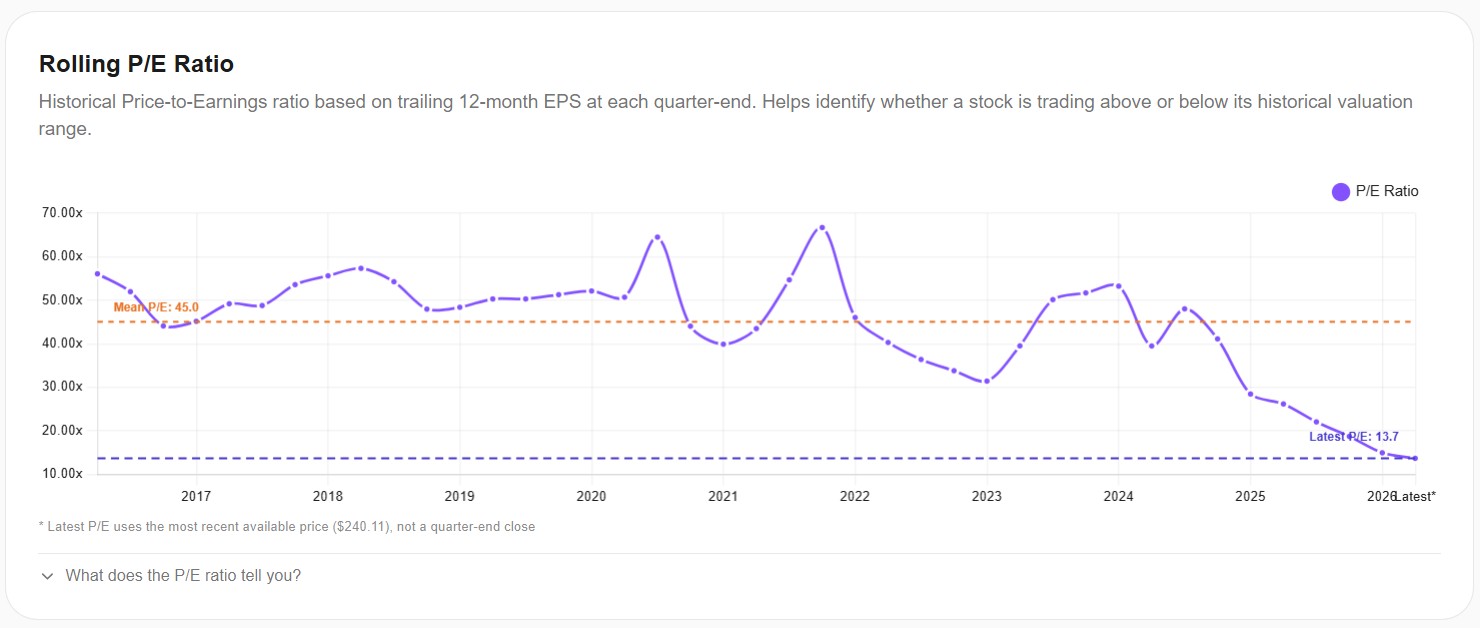
This chart is the entire reason this case study exists. Adobe's historical mean P/E over the last decade is 45.0x. Today's P/E is 13.7x. That means Adobe is currently trading at less than one-third of its historical valuation average.
Look at the trajectory. From 2017 through 2021, Adobe consistently traded at 45-65x earnings. Since 2022, the multiple has compressed steadily, and over the last 12 months it's collapsed to its current level. This isn't a small deviation from the mean — it's a fundamental rerating of how the market values this business.
The question is: is the rerating justified by deteriorating fundamentals, or has the market overreacted?
Layer 2: Profitability quality
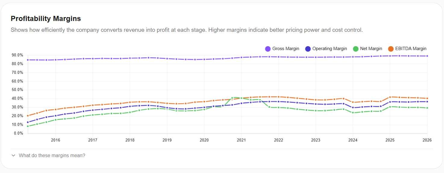
Here's where the story gets interesting. Adobe's gross margin has been remarkably stable at 88-89% for an entire decade. Operating margin sits around 35%, EBITDA margin around 40%, net margin around 28-30%. None of these are declining. If anything, they've slightly improved over the period when the stock was being punished.
This is the first signal that the market's narrative ("Adobe is in decline") doesn't match the data ("Adobe's margins are unchanged"). A company that's actually losing pricing power and competitive position would show margin compression. Adobe shows none.
Layer 3: Growth trajectory
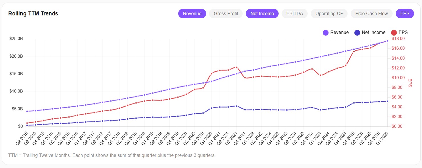
Now look at the trajectory. Adobe's revenue has grown from roughly $5B in 2015 to over $24B in early 2026 — a near-perfect linear progression. Net income grew alongside it, and EPS climbed from around $1 to $17 over the same period. There is no inflection point. There is no plateau. There is no decline. The business is doing exactly what it has been doing for a decade: growing steadily, consistently, profitably.
If Adobe were in actual decline, we'd expect to see revenue flatten, net income compress, or EPS roll over. None of those things are happening.
Layer 4: Returns on capital
The final layer might be the most surprising one. Adobe's ROE has actually accelerated over the last 18 months, climbing from around 30% to over 60%. ROA has been steadily climbing toward 25%. These aren't the metrics of a deteriorating business. These are the metrics of a business becoming more efficient at deploying capital — the opposite of decline.
What Adobe's 4 layers tell us
All four layers point in the same direction:
- Layer 1 (valuation): Trading at one-third of historical average
- Layer 2 (margins): Stable at industry-leading levels
- Layer 3 (growth): Steady linear growth in revenue, earnings, and EPS
- Layer 4 (returns): Accelerating capital efficiency
This is the textbook pattern of a potentially undervalued stock. The market has decided Adobe is in decline, but the financial data doesn't show decline anywhere. That's not a guarantee that the stock will recover — narratives can persist for years, and there are real risks around AI competition that the numbers don't capture. We covered those in our deep dive on Adobe. But it does mean the price is being driven by sentiment, not by fundamentals — and that's the kind of mismatch that often eventually corrects.
Case Study 2 — NVIDIA (NVDA): When "Expensive" Doesn't Mean What You Think
If Adobe is the obvious "cheap stock" case, NVIDIA is its mirror image. Everyone knows NVIDIA. Everyone has an opinion. The dominant narrative on Reddit and finance Twitter is that NVDA is "in a bubble" and "way overvalued." Let's see what the framework actually says.
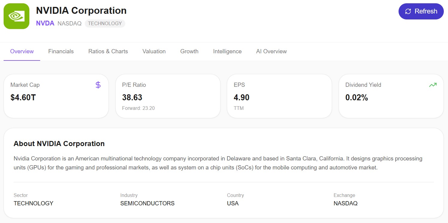
The headlines: market cap of $4.60 trillion, P/E of 38.63, forward P/E of 23.20, EPS of $4.90. A $4.6T market cap and a 38x P/E sound like exactly the numbers that justify the "bubble" narrative. Let's apply the 4 layers and see if that holds up.
Layer 1: Historical valuation context
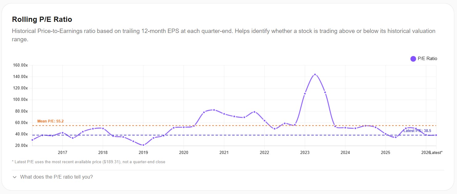
This is where most people are surprised. NVIDIA's historical mean P/E over the last decade is 55.2x. Today's P/E is 38.5x. That means NVIDIA is currently trading at roughly 70% of its historical valuation average — below its 10-year mean, not above it.
Look at the chart. Over the last decade, NVIDIA spent extended periods at 60-80x earnings, and even spiked to over 140x during 2023. Today's 38x is actually one of the lower readings of the last 6 years. Yet the public narrative is that NVDA is "expensive" or "in a bubble."
That narrative is based on comparing 38x to some abstract "fair P/E" of 15-20x — a comparison that ignores how this specific business has actually been priced for the past decade. By its own historical standard, NVIDIA today is the cheapest it's been in years.
But wait. There's an obvious counter-argument: maybe NVIDIA should have a lower P/E now than it did historically, because it's a bigger, more mature business that can't grow at the same rate. Let's see if the fundamentals support that.
Layer 2: Profitability quality
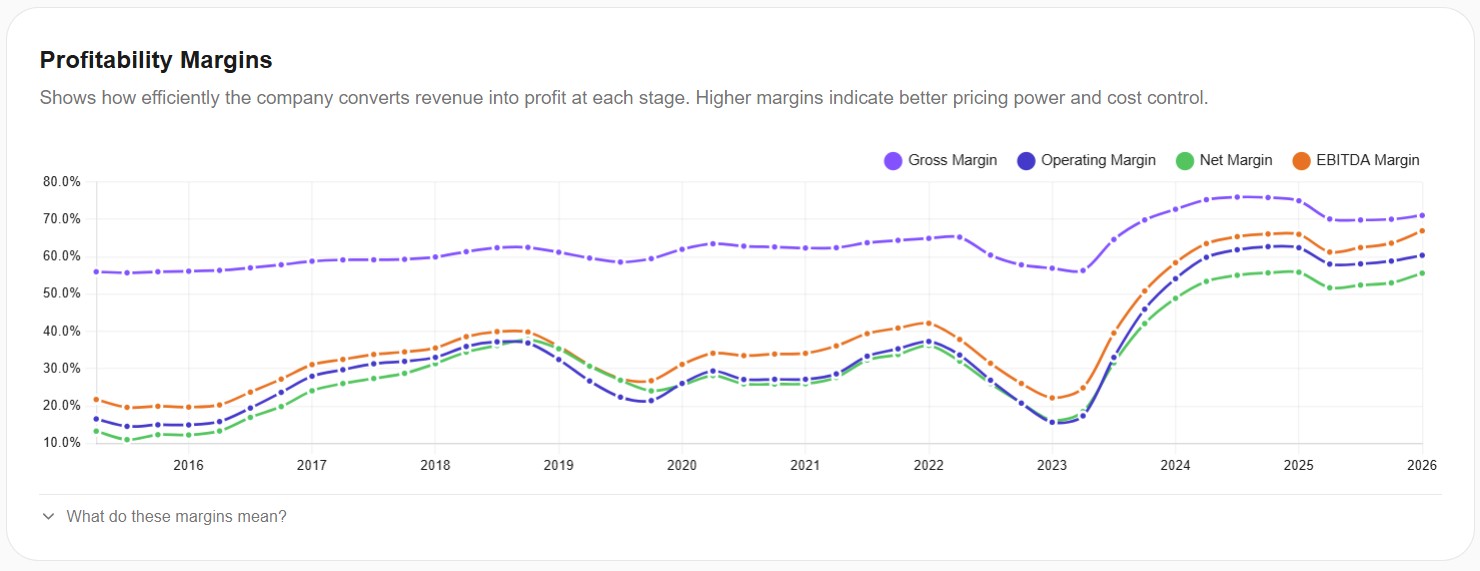
This chart is the moment everything changes. From 2015 through early 2023, NVIDIA's gross margin oscillated in a fairly normal range of 55-65%. Operating margin moved between 20-35%. Then something happened around mid-2023: gross margin jumped to 75% and stayed there. Operating margin doubled from ~30% to ~60%. EBITDA margin climbed from 35% to nearly 70%.
This is not a normal business cycle. This is a structural step change. The economics of NVIDIA's business fundamentally improved in a way that has no precedent in its own history. Margins like these are typically associated with monopoly-like pricing power, not commodity hardware.
So when you look at the P/E of 38x today and compare it to the historical mean of 55x, you have to ask: is the business today the same business as the one with the historical mean? The margins say no. The margins say this is a different, structurally more profitable business than the NVIDIA of 2015-2022.
Layer 3: Growth trajectory
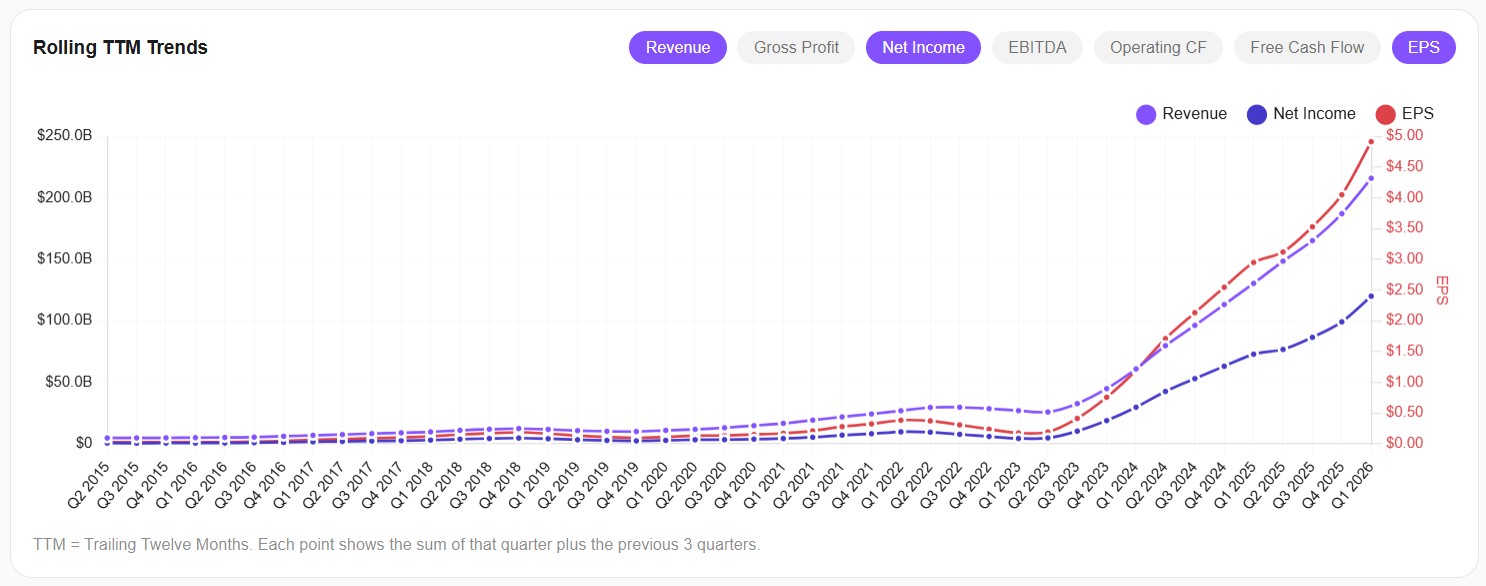
The growth chart confirms what the margins suggested. From 2015 through early 2023, NVIDIA's revenue grew from about $5B to roughly $25B — solid but not extraordinary, around 17-20% annualized. Then revenue exploded vertically: from $25B to over $200B in roughly two years. EPS made a similar move, climbing from under $1 to nearly $5.
Again, this is not normal growth. This is a transition to a completely different scale of business. Revenue grew 8x in 24 months. The company today, by raw size, is a different company than it was 3 years ago — much like how 2018 Amazon was a different company than 2008 Amazon, even though the name and ticker were the same.
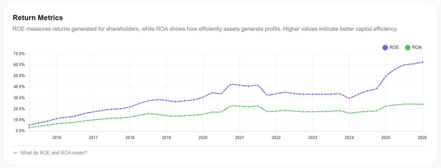
Layer 4: Returns on capital
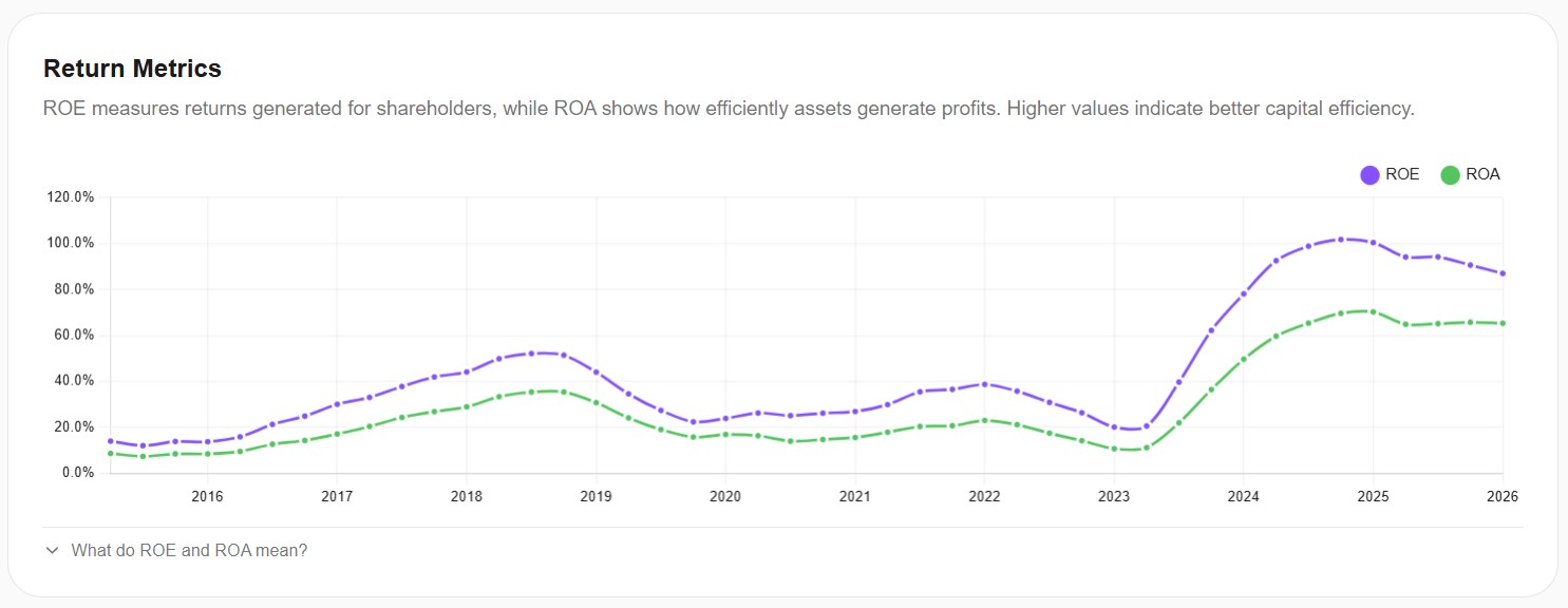
The final layer drives the point home. NVIDIA's ROE oscillated around 25-40% for years. Then in 2024 it accelerated vertically, peaking around 100% and stabilizing in the 85-95% range. ROA followed the same pattern, climbing from around 15-20% to a peak of 70% before settling around 65%.
ROEs in the 80-100% range are the kind of numbers you see from monopolies, premium luxury brands, or businesses with exceptional pricing power. They're not the numbers of a "bubble" company. They're the numbers of a business that earns extraordinary returns on every dollar of equity invested — at a scale of $4 trillion.
What NVIDIA's 4 layers tell us
Putting them together:
- Layer 1 (valuation): Below 10-year average, not above
- Layer 2 (margins): Structural step change to ~75% gross / ~60% operating
- Layer 3 (growth): 8x revenue growth in 24 months, EPS up 5x
- Layer 4 (returns): ROE near 100%, ROA near 65%
The 4 layers tell a very different story from the public narrative. NVIDIA is not "expensive" by its own historical standard — it's actually below average. And the fundamentals that justified its historical premium have, if anything, gotten dramatically better. By a strict reading of the framework, this is closer to a fairly valued or potentially undervalued stock than an overvalued one.
That doesn't mean NVIDIA is a guaranteed buy. The real risk here isn't the current P/E — it's whether the AI demand wave that drove this margin step change is durable for another 5-10 years, or whether it normalizes back to historical levels. If demand normalizes, today's "low" P/E could quickly become tomorrow's "high" P/E. But that's a thesis-level question about the future, not a valuation question about the present. The framework can't answer it for you. It can only tell you that, based on the current data, the conventional wisdom that NVDA is "in a bubble" doesn't match the numbers.
The Lesson: Valuation Is Contextual, Not Absolute
The two case studies above are intentionally provocative. Most retail investors looking at Adobe (P/E 14) and NVIDIA (P/E 38) would conclude immediately that Adobe is cheap and NVIDIA is expensive. The framework reveals that the opposite might be closer to the truth: Adobe is cheap and the fundamentals don't show decline (genuine potential undervaluation), while NVIDIA is "expensive" by absolute number but actually below its historical average and sitting on a structurally improved business (closer to fairly valued).
The meta-lesson is that valuation is always contextual. Every time you hear someone say "stock X is cheap" or "stock Y is expensive," ask two questions: cheap or expensive compared to what? And what are the fundamentals doing right now? If the answer is "cheap compared to its history, with stable fundamentals," that's potentially undervalued. If the answer is "cheap compared to its history, with deteriorating fundamentals," that's a value trap. If the answer is "expensive in absolute numbers, but business fundamentals have structurally improved," that's a justified premium — possibly even a bargain depending on your view of the future.
A single number can never tell you which one you're looking at. Only the combination of valuation context + fundamentals trajectory can.
How to Apply This to Any Stock
The good news is that this framework is fast once you know what to look for. For any stock you're considering, you can run through the 4 layers in about 10 minutes using a tool like Awalyt's fundamental analysis module:
- Pull up the rolling P/E ratio over 10 years. Where is it today versus its mean? More than 30% below the mean is a strong signal worth investigating further. More than 30% above is a yellow flag that demands explanation.
- Look at the profitability margins over the same period. Are gross, operating, and net margins stable? Improving? Deteriorating? Stable margins through a price drop suggest mispricing. Deteriorating margins suggest the price drop might be earned.
- Check the rolling TTM trends for revenue, net income, and free cash flow. Linear growth, acceleration, plateau, or decline? The shape of the curve is more informative than any single quarter.
- Verify ROE and ROA over the same period. Rising returns on capital usually mean the business is getting better. Falling returns usually mean it's getting worse.
If all four layers point in the same direction, you have a clear signal. If they diverge — which is common — you have a story to investigate further. Either way, you're asking the right questions instead of relying on a single P/E number.
Important Caveats
A few things this framework does not do, and that you should never expect from any valuation framework:
- It is not a buy or sell signal. It's a way to ask better questions, not a way to skip the analysis.
- It does not account for narrative risk. Adobe's challenge isn't in the financials — it's in the market's belief about future AI competition. NVIDIA's risk isn't in the financials — it's in the durability of AI demand. Numbers can't tell you about narratives.
- It does not predict the future. Past margin trends don't guarantee future margin trends. A backtest of fundamentals is not a forecast.
- It works best for established companies. It is much less useful for early-stage businesses, pre-revenue companies, or anything where 10 years of history don't yet exist.
The framework is a starting point for serious research, not a substitute for it. It protects you from making decisions based on a single number — which is, in retail investing, one of the most common ways to lose money.
Key Takeaways
- A single P/E ratio tells you almost nothing. Cheap stocks can be traps. Expensive stocks can be bargains. The number alone is meaningless.
- The 4-layer framework combines historical valuation context, profitability quality, growth trajectory, and returns on capital. When all four agree, you have a signal. When they diverge, you have a story to investigate.
- Adobe looks cheap (P/E 14 vs. historical mean 45) and the fundamentals show no decline — margins stable at 88% gross, ROE accelerating to 60%+, revenue growing linearly. Pattern: potentially undervalued.
- NVIDIA looks expensive at 38x P/E in absolute terms, but is actually below its historical mean of 55x — and the underlying business has structurally improved (gross margin 75%, ROE near 100%, revenue 8x in 24 months). Pattern: closer to fairly valued than overvalued, despite the public narrative.
- The lesson: valuation is always contextual. Don't ask "is this stock cheap?" Ask "is it cheap compared to its own history, and what do the fundamentals say?"
The biggest mistake in retail investing isn't buying the wrong stock. It's buying the right stock for the wrong reason — or selling the right stock because a single number scared you. The 4-layer framework won't make you a perfect investor, but it will protect you from the worst of both errors.
Want to test these insights on your own portfolios?
Awalyt is a portfolio analysis platform: backtesting on daily data, fundamental analysis, asset analysis, and AI-powered insights.
Get Started FreeRelated Insights
How to Use Historical P/E to Tell If a Stock Is Cheap or Expensive [2026]
10 min read
Is Adobe the Most Undervalued Tech Stock Right Now? A Data-Driven Analysis [March 2026]
14 min read
Nike Stock: Turnaround or Value Trap? What the Data Shows Before Q3 Earnings [March 2026]
14 min read