How to Run a Free DCA Backtest (VOO Example) [2026]
Most people set up a DCA plan the same way. They pick an ETF or a stock from something they saw recommended on Reddit, Bogleheads, or YouTube, set a monthly automatic contribution at their broker, and let it run for ten years.
What almost nobody does is check, even once, how that exact decision would have played out in the past.
That's a strange gap, because the check is quick, free, and tells you something concrete before you commit money. This piece walks through how to run it with the Awalyt DCA calculator, why I think it belongs before the plan rather than after, and where a single-asset backtest stops being able to help.
Disclaimer: This article is for educational and informational purposes only. It does not constitute investment advice. Past performance does not guarantee future results. Always do your own research before making any investment decisions.
How to run it
Open the Awalyt DCA calculator. Free, no signup, no email to see results.
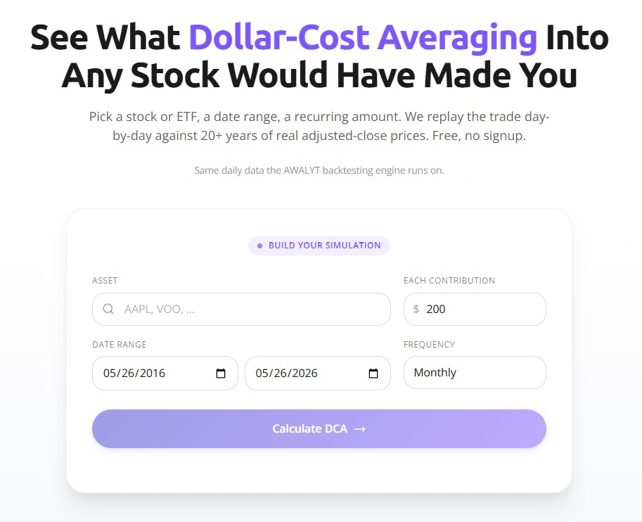
Three inputs. Asset: any US-listed stock or ETF, AAPL, VOO, QQQ, BND, GLD, whatever you're weighing, with autocomplete from the supported universe. Date range: the window you want to test, anywhere from three years to two decades, since the data goes back 20+ years for most US assets. Contribution amount and frequency: the recurring dollar figure and the cadence, weekly through quarterly. Most people choose monthly, because that's how paychecks land.
Hit Calculate DCA and the simulation runs against daily adjusted-close prices across the whole window.
What comes back
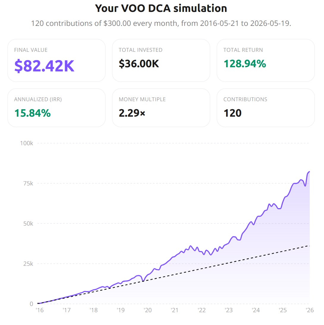
The example above is $200/month into VOO over ten years, May 2016 to May 2026. You get six numbers and a chart. The headline ones are final value (what the position is worth at the end), total invested (the capital you put in), and total return (the two compared as a percentage). The one that matters most is annualized return — the money-weighted IRR on your staggered buys, which is the correct figure for DCA and not the same as a lump-sum CAGR. Alongside those sit the money multiple (how many times your contributed capital you finished with) and the contribution count.
The chart plots portfolio value over time against a dashed line of cumulative contributions. Above the dashed line you're in gain; below it you're underwater, and you can see exactly when that happened and how long it lasted.
Why run it first
A backtest gives you things a forum thread can't. Most online advice is some version of "X was a great DCA," and almost none of it shows the chart. Run the simulation and you see the real curve: where it climbed, where it stalled, where it sat underwater for two years before recovering. That's a different mental picture than a confident sentence with nothing behind it. The effect is sharpest on assets everyone "knows" did well. The QQQ story people tell is a great one, but the QQQ chart through 2022 is a separate conversation, and most of the people recommending it have only kept the first half in their head.
It also shows you what different market regimes feel like, the part DCA articles flatten into a single average. 2016 to 2019 was mostly boring and rewarding. 2020 was a 30% drop and an explosive snapback. 2022 was a slow bleed that ran most of the year. Drag the start date to 2008 and watch eighteen months underwater; slide it to 2015 and watch a near-uninterrupted climb. Same asset, completely different lived experience, and that experience is what decides whether you'd have stuck with the plan.
You don't need real money to learn any of this. Put in $50 or $100 a month if that's where you are. The curve shape, the IRR, the drawdown patterns come out identical; only the absolute dollars scale. I find the smaller numbers can teach more, because you stop staring at the final balance and start watching the dynamics.
It also swaps nostalgia for arithmetic. "What if I'd started $300/month into Apple in 2010" is an idle thought most investors have had. You can answer it in a minute, and you can answer the more honest version too: the one where you'd have picked Intel instead of Apple back then and ended up with a very different number. That second run is the one that teaches you something about hindsight. Thinking in numbers instead of vibes is a habit that pays off on the decisions still ahead of you, which is the only place it can.
The honest limits
Lump-sum has usually beaten DCA, and it's worth knowing why before someone uses the fact against you. If you're holding cash and deciding whether to deploy it all now or spread it over a year or two, the record is consistent: deploying at once wins roughly two-thirds of the time, because markets drift upward more often than not and earlier money compounds longer. The catch is that this only applies if you have a lump sum. The salaried investor moving 10% of each paycheck into VOO isn't choosing DCA over lump-sum; the income arrives in installments, so there's nothing else to weigh it against. Have liquid capital, deploy it. Have income flowing in, DCA it. Both are right for the situation that produced them.
Past returns don't predict future ones either, and that bites harder here than people expect. A 15% IRR on VOO from 2016 to 2026 is not the figure to pencil in for 2026 to 2036. The last decade ran well above the long-run average, and the next is unlikely to copy it. Read the backtest as a record of how the asset behaved across conditions, not a forecast.
And this is one asset at a time, which makes it a starting point rather than a portfolio. A real portfolio has several positions, a target allocation, and some rebalancing rhythm, none of which a single-asset DCA captures. If your real question is "what would $150 into VOO and $150 into VT have done together, rebalanced quarterly," running each separately gets you halfway; it won't show the rebalancing effect or how the two positions interact. That's a portfolio question, and it needs a portfolio tool.
A few runs worth trying
If you've never done this, start with the same asset over two different decades: $200/month into VOO from 2008 to 2018, then from 2015 to 2025. The IRRs and the chart shapes barely resemble each other, which is the most direct way to feel what "markets are path-dependent" really means. From there, run VOO against AAPL on the same input; the gap between an index and a single stock tends to be wider than people guess, and it lands harder as two IRRs side by side than as any pie chart.
Then pressure-test the diversification stories you've absorbed: VOO, then VT, then VXUS. Over 2016 to 2026 the US wins comfortably; over other windows it doesn't, and seeing both keeps you from turning one decade into a rule. The last run is the asset-class one, VOO vs. GLD vs. BND vs. SCHD over the same ten years, where the spread is wide enough to show that which asset class you pick matters more than which ticker you choose inside it. I ran that one in full on ten popular assets, including the result that caught me off guard, in 10 Years of $300/Month DCA on 10 Popular Assets.
If you hold more than one ETF, the companion guide on checking ETF overlap runs the same before-you-buy logic on whether two funds are really two bets.
When the question becomes a portfolio
The single-asset backtest is right for the single-asset question, and most investors eventually have a different one. What happens if you DCA $200/month into VOO and $100/month into BND and rebalance to 70/30 every six months? Two separate runs can't tell you, because they ignore both the interaction between the holdings and the drift correction that rebalancing applies. That's the job of the full Awalyt platform: multi-asset backtesting on the same daily-precision data the calculator uses, with rebalancing logic, drift tracking, and risk metrics. If you want the background first, the introduction to portfolio backtesting is the entry point.
Bottom line
A monthly DCA plan is a commitment in slow motion. $300 a month for ten years is a $36,000 decision, even if it never feels like one, one contribution at a time. Spending a minute to see how that exact plan has behaved through past markets is a small thing to ask of yourself. The calculator is here whenever you want it.
This article is for educational and informational purposes only. It does not constitute financial, investment, or tax advice. Past performance does not guarantee future results. Always do your own research and consider consulting a qualified financial advisor before making investment decisions.
Want to test these insights on your own portfolios?
Awalyt is a portfolio analysis platform: backtesting on daily data, fundamental analysis, asset analysis, and AI-powered insights.
Get Started FreeRelated Insights
10 Years of $300/Month DCA: What Happened on VOO, QQQ, AAPL, and 7 Other Popular Assets [2026]
11 min read
How to Check ETF Overlap for Free (VOO vs QQQ) [2026]
9 min read
Why Is My Portfolio Underperforming the S&P 500? [2026]
11 min read
What Is Factor Investing? A Practical Guide with 12 Years of Real Data [2026]
14 min read
Backtesting a Portfolio: 6 Common Mistakes and How to Avoid Them [2026]
11 min read
How to Use Historical P/E to Tell If a Stock Is Cheap or Expensive [2026]
10 min read