Read the Truth About Your Diversification
Diversification is not a feeling, it is a measurement. The measurement is correlation: how your holdings actually move together, read quarter by quarter on daily data rather than flattened into one average number. Awalyt computes it on your real portfolio.
Get Started FreeFree plan. No credit card.
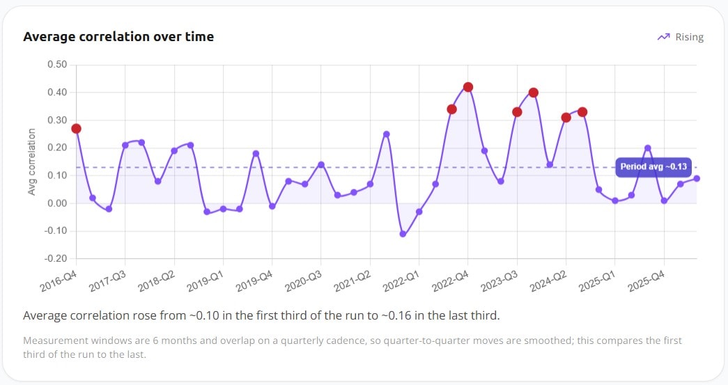
One Average Number Cannot Describe How a Portfolio Behaves.
Most tools sum diversification up as a single figure: average correlation 0.4, and move on. It reads like a grade. It is really an average of very different periods stacked on top of each other.
What decides how a portfolio holds up is not the lifetime average. It is how holdings move together across different market conditions.
Two holdings can drift apart for years and then move closely for a few quarters, or the reverse. A single number hides that entirely. To read diversification honestly you need to see correlation change over time, period by period, on the assets you actually own.
How to Read Diversification Properly
The decisive check is historical correlation. Two prechecks on what you hold make it easier to interpret.
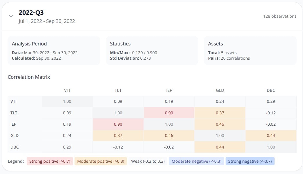
Every pair, quarter by quarter
Correlation runs from +1 to -1. At +1 two holdings move in perfect step, at 0 they move independently, at -1 one rises as the other falls. Awalyt lays out every pair as a matrix and computes it per quarter, so you read diversification as it behaves in each period, not as one blended figure. This is how the matrix reads: the more pairs sitting well below 1.0, the more the holdings are doing genuinely different jobs.
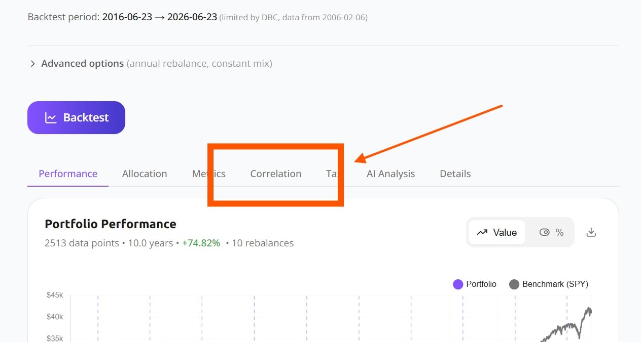
Computed automatically, inside your backtest
You do not build a spreadsheet or export returns. Run a portfolio and the correlation analysis sits right in the results next to performance and risk. It is calculated for you from daily data over the whole period you tested.
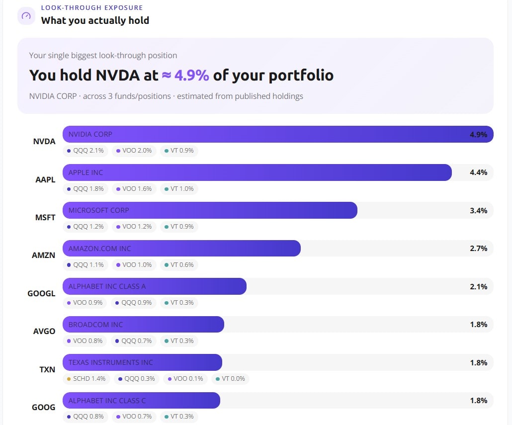
Precheck: what you actually hold
Before correlation, it helps to see what sits underneath your funds. Look-through exposure unpacks every fund to the companies inside it and sums your real weight in each one. This is how look-through works: a single name you never picked directly can add up across several funds into a much larger position than it looks.
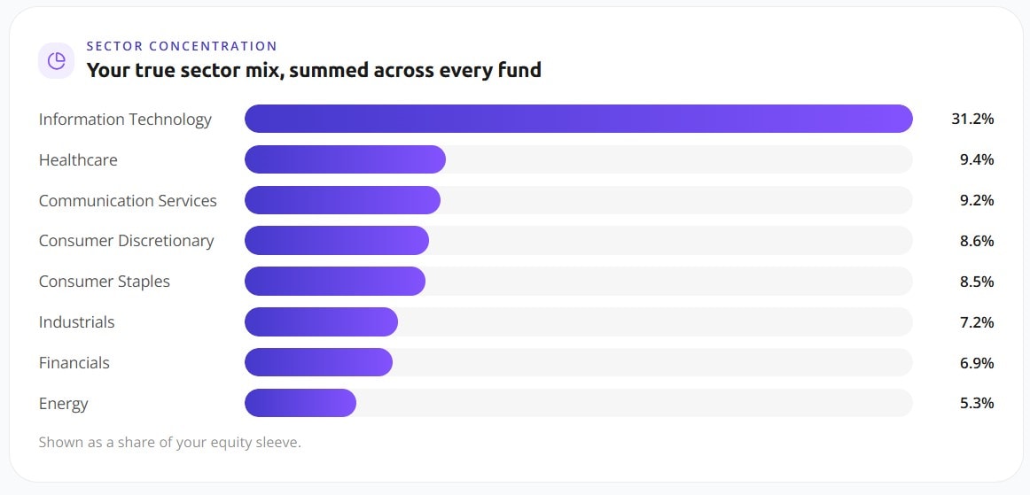
Precheck: where the money really sits
The same look-through, rolled up by sector. It shows the true weight of each sector once every fund is combined, so concentration that is spread across wrappers becomes visible as a single bar rather than hidden across five holdings.
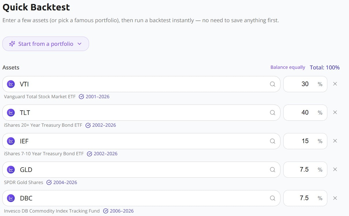
It starts from your real holdings
Enter the assets and weights you actually own, or start from a known portfolio and adjust. Everything above is computed on that exact mix, which is what makes the reading yours rather than a textbook example.
Free plan. No credit card.
A Single Number, or the Whole Picture
The difference is not more data for its own sake. It is reading diversification as something that moves over time.
The single averaged number
- ·One correlation number, averaged over the whole history
- ·Often built on monthly data, which smooths over sharp joint moves
- ·A generic pairing, not the portfolio you actually hold
- ·No way to see when correlation rose or fell
Awalyt correlation analysis
- A correlation matrix computed per quarter, so you see it change
- Built on daily returns, closer to how holdings really moved
- Calculated on your exact assets and weights
- Correlation over time, plotted across the full period
Correlation is measured from history and it changes with the market. It describes how your holdings have moved, not a prediction of how they will move next.
Daily data
Correlation from daily returns, not monthly averages
Quarter by quarter
A matrix per period, not one lifetime figure
Your holdings
Computed on the exact assets and weights you enter
Frequently asked questions
Correlation measures how two holdings move relative to each other, from +1 (in perfect step) to -1 (opposite). Adding holdings only reduces risk if they move differently. Ten funds that all track the same correlation near 1.0 behave like one position, so the count of tickers tells you far less than how they move together.
An average blends calm periods, when holdings drift apart, with crisis periods, when they snap together. The single figure looks moderate while hiding the fact that your worst-case correlation, the one that actually hits you in a drawdown, is much higher.
In a sell-off investors reprice risk across the board at once, so assets that normally move on their own start moving with the broad market. Pairs that sat comfortably apart in calm years can climb toward 1.0 in the quarter it matters most, which is why a per-quarter view is more useful than a lifetime average.
Monthly data uses one return per month, which smooths over the sharp joint moves that define a crisis and tends to understate how tightly holdings move together. Daily data captures those moves, so the correlation you see is closer to the risk you actually carry.
No, and no tool can. Correlation is a historical measure and it shifts as markets change. The point is not prediction. It is seeing clearly how your holdings have behaved, especially under past stress, instead of trusting a single number that hides it.
See how your portfolio really moves.
Run the quarterly correlation matrix and correlation over time on your own holdings, on daily data, in a few minutes. Create a free account.
Get Started FreeFree plan. No credit card.